Nudgemart Chrome Plugin
-
Introduction
Brief: Build a Chrome extension to nudge online grocery shoppers toward healthier choices.
Challenge: Give nutrition feedback without disrupting the shopping flow or cluttering sites.
Goals: Instant, actionable nutrition info and gentle nudges for better swaps.
-
Discovery Phase
Stakeholder interviews: Hackathon with devs and health experts.
Business requirements: Must blend with any grocery site, be lightweight, and easy to use.
User needs assessment: Shoppers want quick nutrition cues, no extra steps, and minimal pop-ups.
-
Problem Framing
Problem statement: Shoppers can’t see nutrition info at a glance and often make unhealthy choices by default.
Success criteria: Users notice and act on nutrition cues, with no frustration or site conflicts.
Constraints & assumptions: Minimal UI, must not break site layouts, and work for all browser users.
-
User Research
User interviews: Shoppers shared that too many pop-ups or overlays make them quit.
Competitive analysis: Most health plugins were either too intrusive or too hidden.
Market research findings: Color-coded, in-context cues get the best engagement.
-
Synthesis
User personas: “The Quick Clicker,” “The Health-Conscious Parent,” and “The Habitual Shopper.”
Journey mapping: From browsing to adding to cart to checkout.
Key insights & opportunities: Users want feedback right where they’re making decisions, not buried in a tab.
-
Solution Development
Information architecture: Two main UI elements—traffic light indicators on product cards and a sidebar key.
Wireframes & prototypes: Iterated on size/placement to avoid overlap with site buttons.
Visual design system: Clean, with bold colors for traffic lights and a simple, persistent sidebar.
-
Testing
Usability testing: Tested on multiple grocery sites; flagged conflicts with site elements.
User feedback: Adjusted sidebar locking and traffic light placement for better visibility and zero interference.
Design iterations: Hid advanced features in the dropdown to keep the main UI clean.
-
Implementation
Handoff process: Annotated UI specs and extension logic to dev team.
Development collaboration: Fast feedback loops to squash layout bugs and optimize load.
Go-to-market strategy: Released on Chrome Web Store, promoted via health forums and social.
-
Results & Impact
Metrics & KPIs: More healthy swaps at checkout, higher extension installs, and strong retention.
User adoption: Shoppers liked the gentle nudges and quick info—less regret at checkout.
Business impact: Helped users build healthier baskets without extra clicks.
Lessons learned: Less is more—subtle, well-placed cues drive better behavior change than pop-ups.
A Users ability in making healthy food choices while shopping online can be
a battle between self control and misdirection. This was the challenge in creating the Nudgeworks Extender, this Chrome browser extension aims to help consumers to shop healthier by presenting information on the nutritional quality of food items and providing tailored feedback on diet quality of foods purchased.
Nudgeworks was the result of a hackathon aimed at pushing users to make healthier choices when choosing food online.
While the purpose of the extension is to add nutritional information, it should not take away from the design of the site or sites it would engage with.
After numerous concepts had been discussed with the development team.
It was felt that two elements should be displayed on the page. Additional elements would hidden in the task bar drop down.
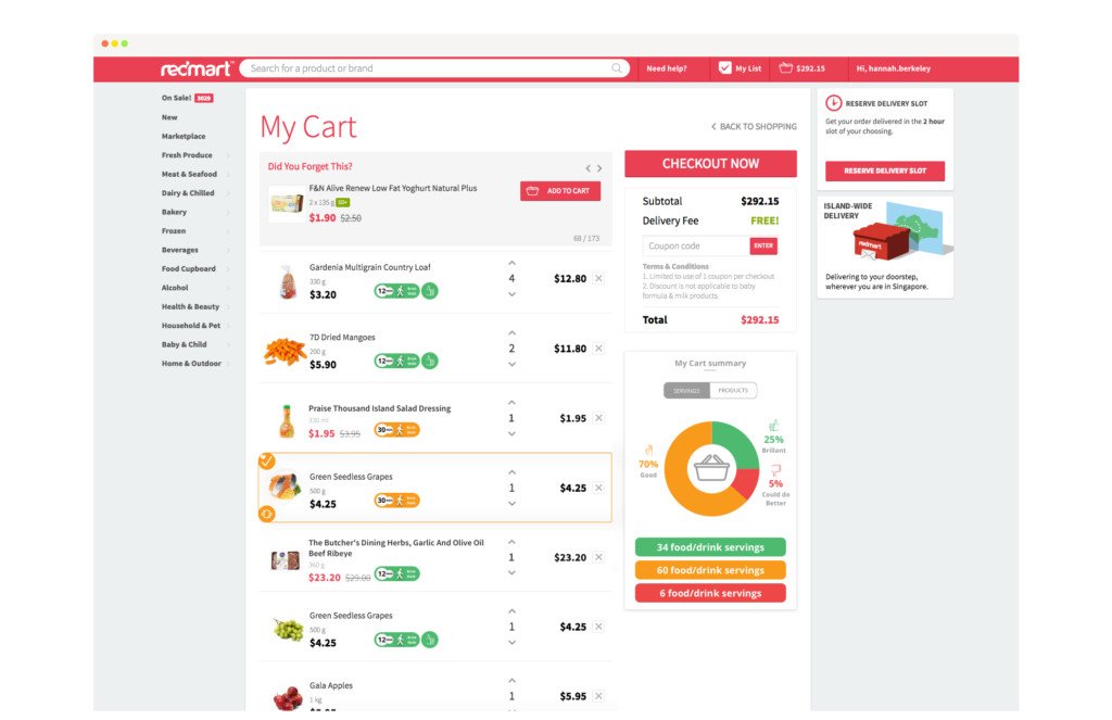
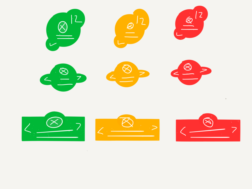
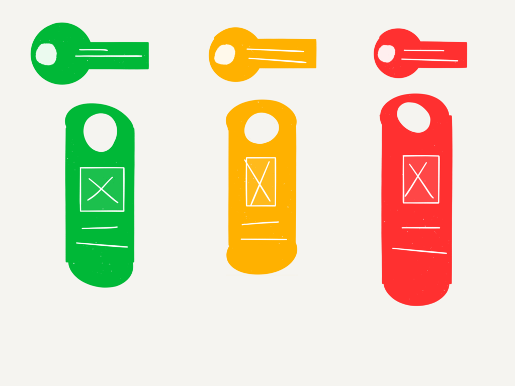
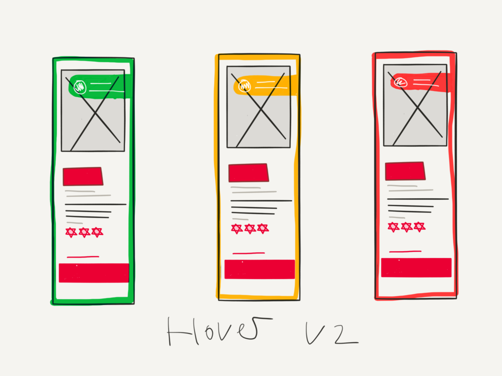
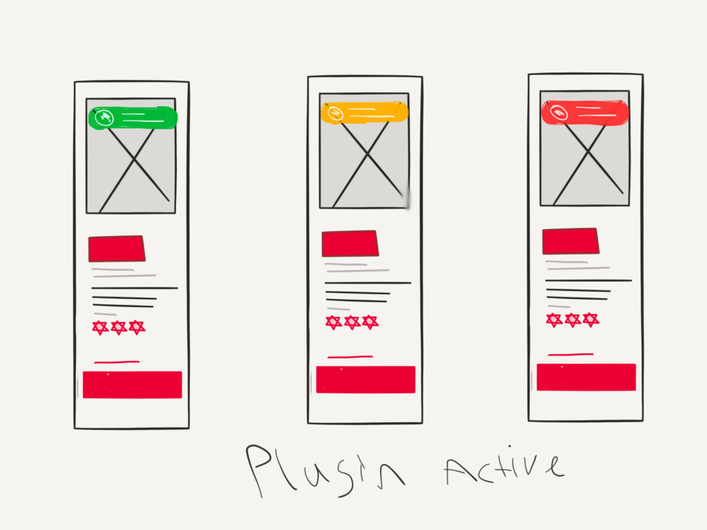
The traffic lights color code indicators, and the key or legend displaying the nutritional value of the item selected.
The traffic light indicators had to convey three important elements of information, color code, type of excerise and time needed to burn off the item selected.
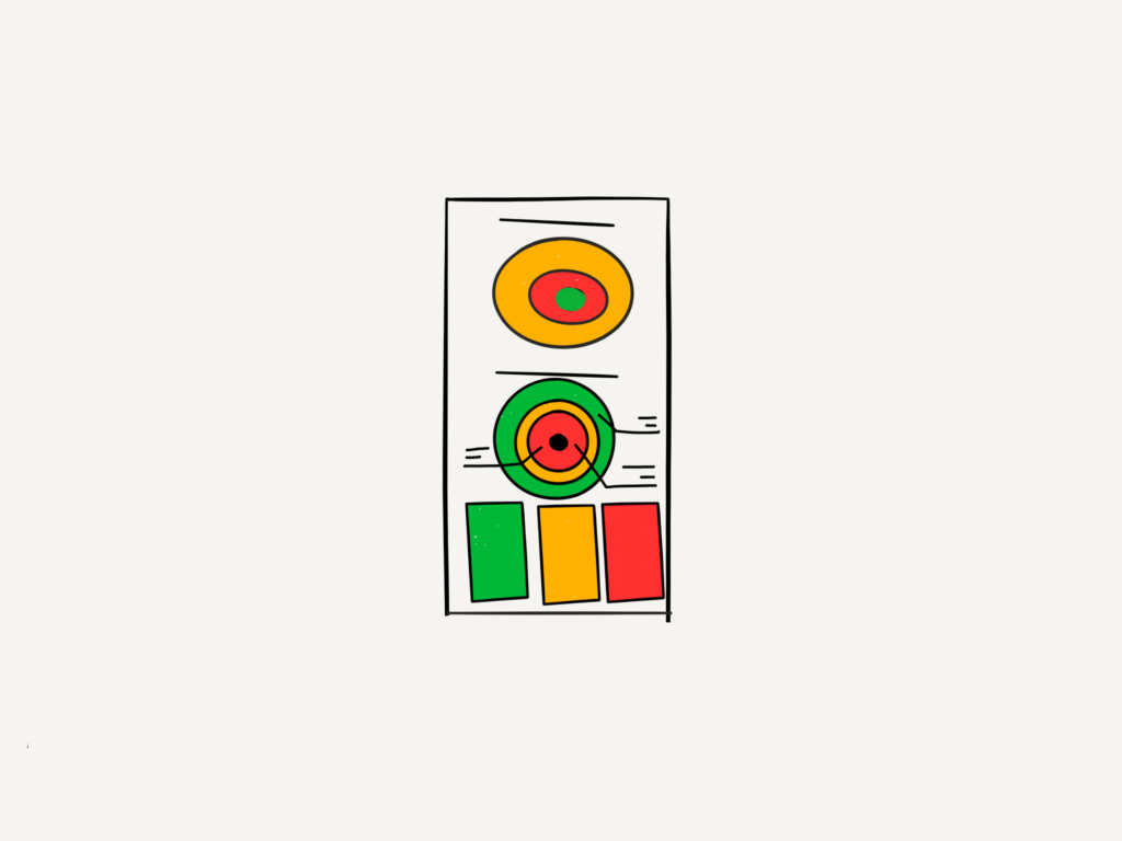
The key would sit on the right of the site and would be locked in place while users scan for items, it would display the users chosen excerise and allow for the user to select from a range of different sports. Below would be a thumbnail of the food selected and and finally. The nutrition facts and ingredients of each product.


With two new elements added to the site a high level of affordance needed to be looked at, as it was clear The properties of the objects on screen could have conflicting functions between themselves and the original element of the site.


When users have selected all the items they want and proceed to the check out items deemed bad for the users are highlighted, and the user is given a pop out window allowing them to Nudge up to a healthy choice. This change will also be reflected in the side panel as to the overall nutritional value of the overall shopping basket.