Glyco Leap App
-
Introduction
Brief: Redesign the learning section of the Glyco Leap app to make diabetes self-education less overwhelming and more engaging.
Challenge: Users are overloaded with info and not motivated to learn about diabetes management.
Goals: Break info into bite-sized, interactive pieces users can actually finish and remember.
-
Discovery Phase
Stakeholder interviews: Met with product team and diabetes educators.
Business requirements: Boost lesson completion, support real-time tracking, and keep users coming back.
User needs assessment: Users want learning to be quick, easy, and fit into daily life.
-
Problem Framing
Problem statement: Users avoid or abandon educational content because it feels too dense and time-consuming.
Success criteria: Higher lesson completion rates and positive feedback on learning experience.
Constraints & assumptions: Must work on mobile, support interactive elements, and not disrupt tracking features.
-
User Research
User interviews: Patients and educators shared what makes learning stick (hint: not long articles).
Competitive analysis: Most diabetes apps dump info in text blocks—users tune out.
Market research findings: Card-based, interactive, and micro-learning approaches drive better engagement.
-
Synthesis
User personas: “The Reluctant Learner,” “The On-the-Go Patient,” and “The Data-Driven Achiever.”
Journey mapping: From app open → dashboard → lesson → activity/quiz → back to tracking.
Key insights & opportunities: Make lessons swipeable, short, and interactive; celebrate small wins.
-
Solution Development
Information architecture: Split education into Dashboard, Lessons, and Activities.
Wireframes & prototypes: Designed card stacks, progress indicators, and quick-access dashboard.
Visual design system: Clean, swipe-friendly UI with cheerful colors and clear icons.
-
Testing
Usability testing: Ran with real users—flagged confusing flows and unclear quiz feedback.
User feedback: Tweaked lesson length, added more interactive activities, and improved navigation.
Design iterations: Smoothed out transitions and clarified progress tracking.
-
Implementation
Handoff process: Delivered annotated wireframes and lesson templates to devs.
Development collaboration: Weekly check-ins to ensure fast load times and smooth interactions.
Go-to-market strategy: Launched with push notifications and in-app tips.
-
Results & Impact
Metrics & KPIs: Higher lesson completion, more quiz participation, and increased daily engagement.
User adoption: Users actually finished lessons and reported better recall.
Business impact: Boosted retention and positive app reviews.
Lessons learned: Small, interactive learning beats big info dumps—make it easy and rewarding.
People diagnosed with diabetes are confronted with some fundamental lifestyle changes. Along with coming to terms with this disorder, users have an overwhelming level of new knowledge to take in, this was the challenge that had to be overcome for the learning section on the Glyco App. The Glyco app is a simple way to stay on top of diabetes. Get real-time insights and expert, human support while tracking blood, glucose, meals, and activities.
One final element needed to be addressed, this was diabetes self-management education, self-education can help lose weight, lower HbA1C and improve quality of life. But getting people to learn more about ways to improve their health is not as easy as it sounds. Flat out, people usually won’t go out of their way to learn something new. Research shows that only 3% of adults in the U.S. spend time learning during their day.


In order to address this pain point, UX had to be at the heart of this mission. Learning has several barriers to entry: you need to figure out what, where, how you want to learn, and then you need the time, money, and energy to follow through.
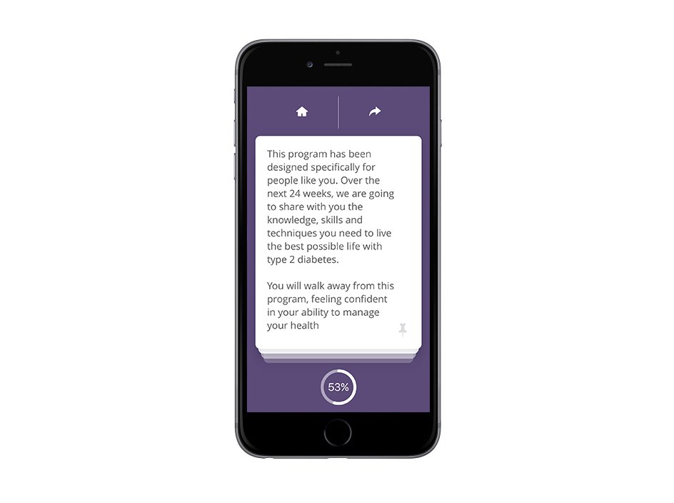
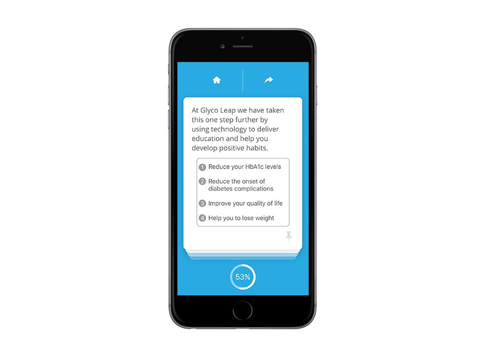
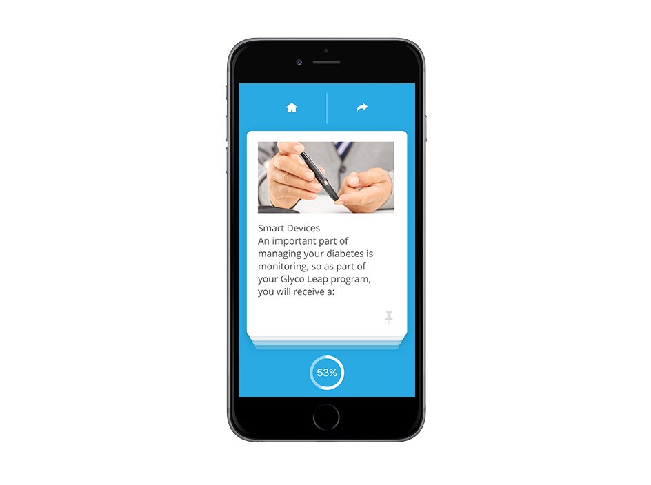
With a sea of information regarding this disorder, chunking was felt like the best solution in lowering the cognitive load on the user. So the concept of cards and stacks was explored, by structuring information to fit these limitations, users’ recollection of that information can be improved.
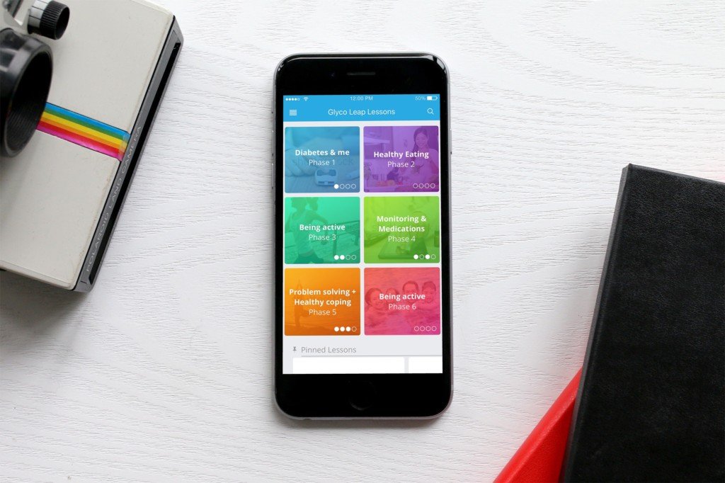
The Education elements of the App were broken into three sections: Dashboard, Lessons, and Activities.
The dashboard is incredibly important because it’s the first thing people see when they open the app. It was best felt that having the 6 phases above the fold, below the user will have access to pinned/saved lessons. This was a quick way to access the cards or lessons users have bookmarked.


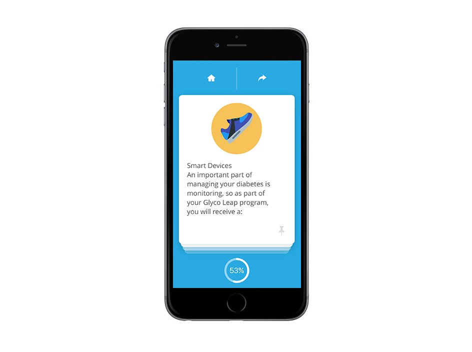
The next element of the app is the lessons themselves. The lessons are meant to be great time-passers; users can do them on the train or while waiting in line at the bank.
The swiping gestures give users a sense of completion with each card and stack. A text document packed with information feels daunting, but a lesson broken down into cards feels manageable. These cards are grouped in stacks of 3 to 7, and once the last card is swiped away, another stack slides into view. Finishing a stack becomes a micro-accomplishment, meaning users don’t have to wait until the end of the lesson to feel like they’ve learned something.


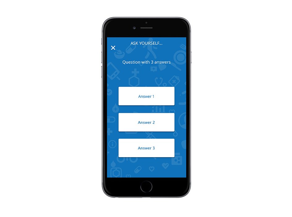
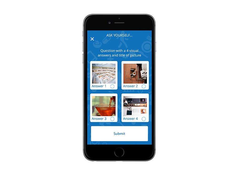
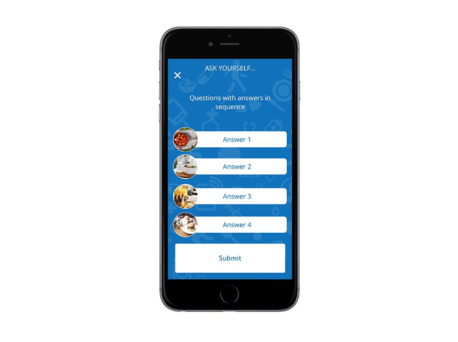
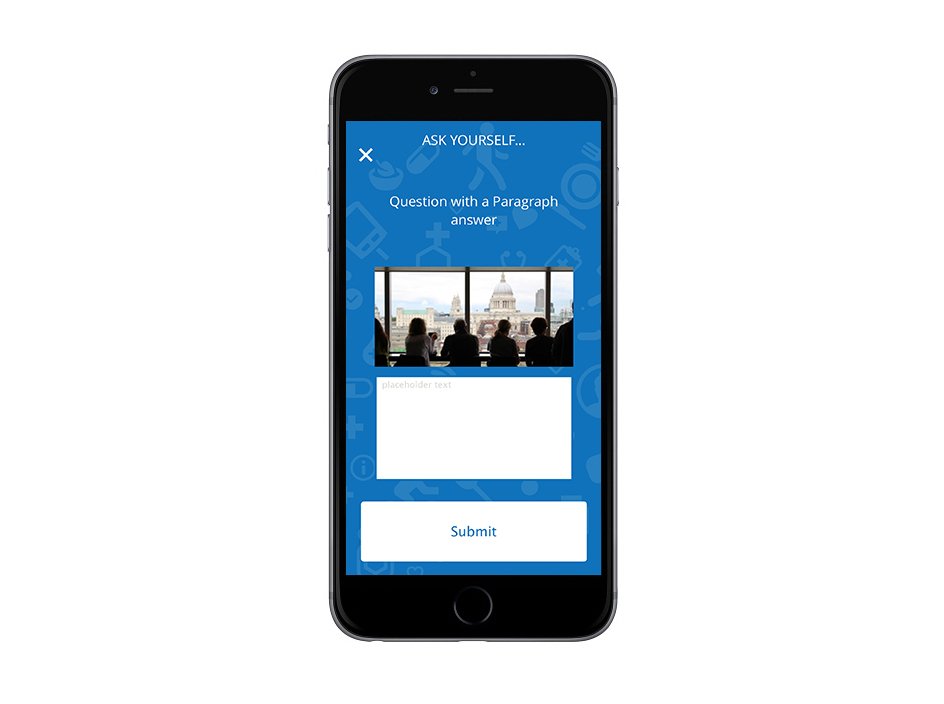
The third and final element of the design is the activities. We landed on seven types of interactions that appear at different times:
Quick Starts appear early in each lesson they include questions with 3 answers, true-false questions, and visual match questions.
Mid-Lesson Activities appear during the lesson; they include matching questions, sequence and word drag questions and finally.
Do This Now questions, they come at the end of the lesson, they include text input questions.