Rio Tinto-Sharepoint Portal
-
Introduction
Brief: Build a SharePoint portal to help Rio Tinto teams share knowledge, find resources, and collaborate.
Challenge: Teams were siloed, info was scattered, and onboarding was slow.
Goals: Make it dead simple for anyone to find what they need, connect with other teams, and update their own pages.
-
Discovery Phase
Stakeholder interviews: Chatted with team leads and new hires.
Business requirements: Centralize info, support team autonomy, and make updates easy.
User needs assessment: Users want fast answers, clear contacts, and a place to find training/docs.
-
Problem Framing
Problem: Teams wasted time searching for info or duplicating work—no one could see the big picture.
Success criteria: Users can find project info, contacts, and resources in two clicks or less.
Constraints: Needs to be flexible for different teams, easy to update, and feel familiar.
-
User Research
User interviews: Dug into pain points—finding contacts, missing docs, and onboarding headaches.
Competitive analysis: Most portals were cluttered or locked down, not self-serve.
Market research findings: Standardized layouts and clear navigation drive adoption.
-
Synthesis
User personas: “The New Joiner,” “The Team Lead,” “The Cross-Functional Collaborator.”
Journey mapping: From landing on the portal to finding a doc, connecting with a team, and getting help.
Key insights & opportunities: Standardize page templates, highlight contacts/resources, and make navigation brain-dead simple.
-
Solution Development
Information architecture: Standardized team pages—intro, apps, training, contacts, org charts, FAQs.
Wireframes & prototypes: Built page templates, played with layouts, and tested with real teams.
Visual design system: Clean, modular, and easy to scan—big headings, clear CTAs, and consistent icons.
-
Testing
Usability testing: Brought in new hires and contractors—flagged missing info and confusing links.
User feedback: Added quick-access buttons, clarified org charts, and made docs easier to find.
Design iterations: Refined layouts, tweaked copy, and cut clutter.
-
Implementation
Handoff: Shared templates and guides with every team.
Development collaboration: Helped teams build out their own pages, reviewed for consistency.
Go-to-market strategy: Rolled out with a “get started” guide and onboarding sessions.
-
Results & Impact
Metrics & KPIs: Faster onboarding, more cross-team connections, fewer “where is X?” emails.
User adoption: Teams actually kept their pages updated, new hires got up to speed faster.
Business impact: Less time wasted, more collaboration, and a stronger sense of community.
Lessons learned: Standardize what you can, but always leave room for teams to make it their own.
As one of the foremost mining companies in the world, Rio Tinto is characterized by a multitude of moving parts, encompassing various teams, processes, projects, and products. The pivotal design brief for the Commercial Services & Digital Portal revolves around ensuring that teams remain cognizant of each other’s activities, roles, and contributions, thereby facilitating seamless collaboration and knowledge exchange.
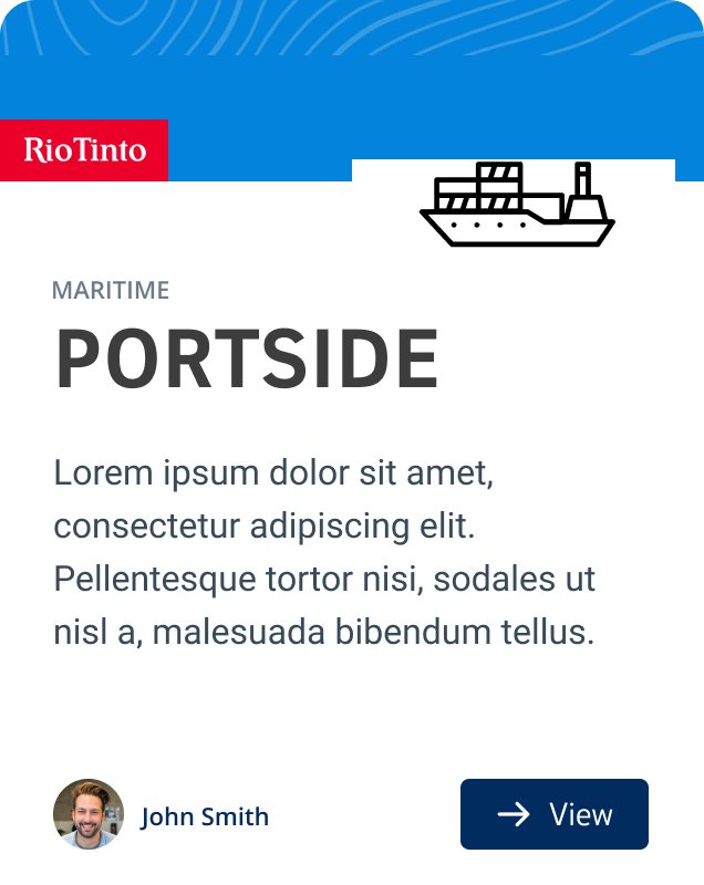
Project cards
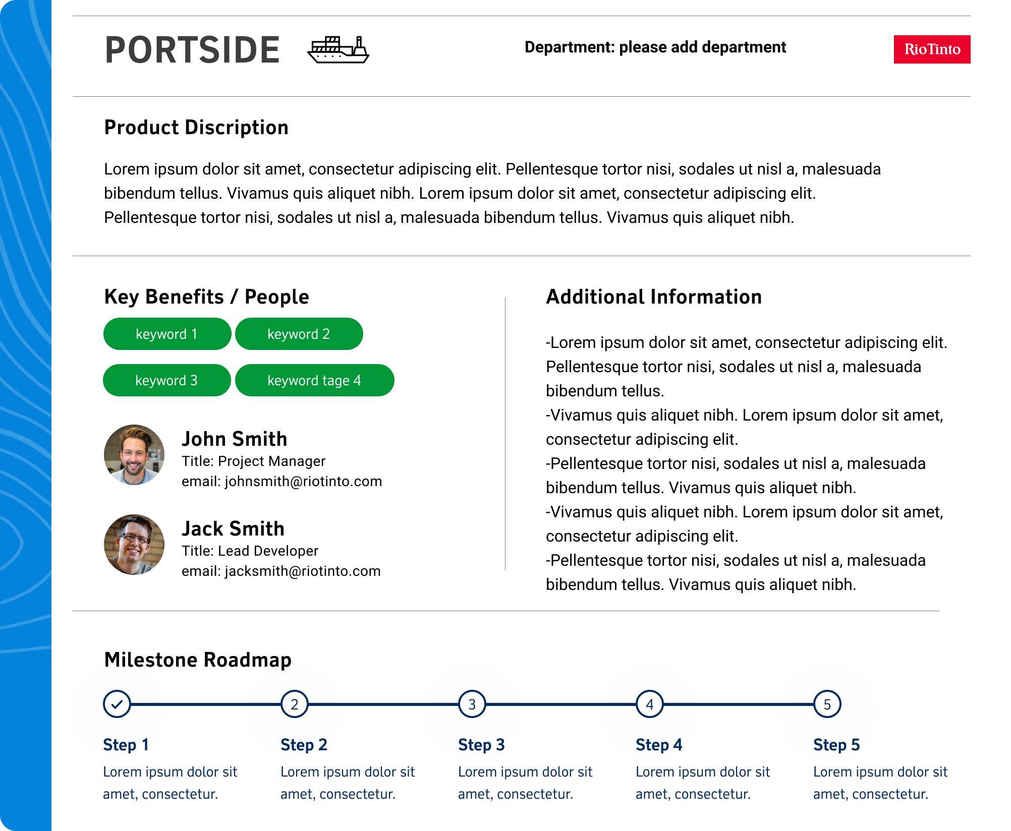
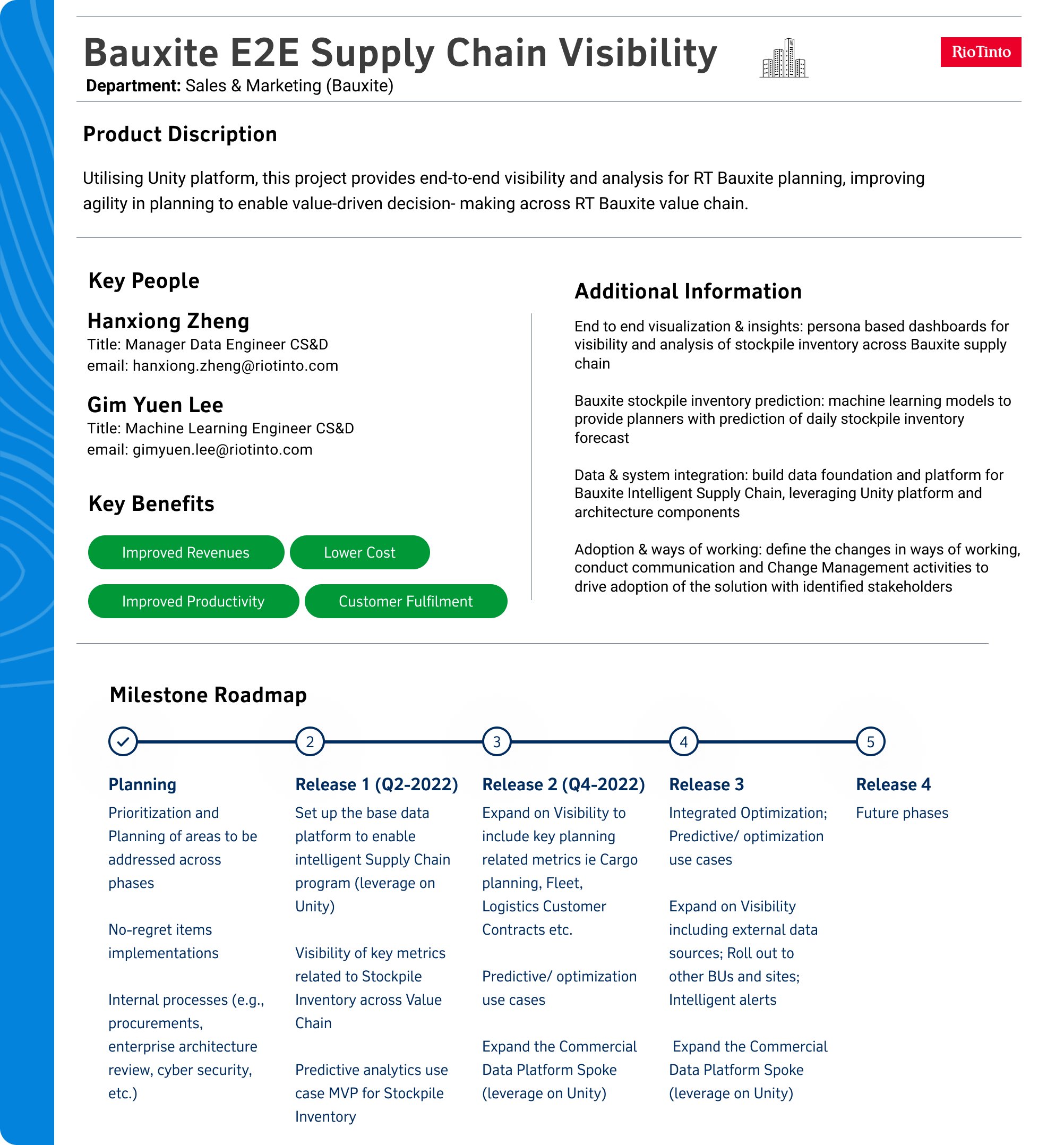
The initial inception of this knowledge sharing initiative stemmed from valuable feedback indicating that staff members lacked awareness of the ongoing projects within teams. As a result, the idea of implementing project cards for each team materialized, featuring a brief overview of the product, its primary advantages, team members involved, and supplementary details, supplemented by a milestone roadmap for comprehensive visibility.
After conducting thorough User Research to evaluate the potential impact and usefulness of the information, it was determined that the accessibility of these cards could be enhanced by integrating dedicated buttons within the internal intranet. The initial concept evolved into envisioning a more structured portal that individual teams could effectively manage. The sheer scale of Rio Tinto's operations necessitated a more formalized approach, given that crucial information was often dispersed across unwieldy Word or PowerPoint documents, stalling efficient retrieval. Consequently, the implementation of a Sharepoint portal was recommended as the optimal solution.
Further insights gleaned from the User Research revealed specific areas of interest for the users. In-depth user interviews made it clear that, besides a brief introduction and features, the most significant aspects revolved around the levels of contact within each product, access to any of the teams' trainings or helpful documents, and leadership maps. Armed with this valuable knowledge, the Sharepoint portal was strategically customized to comprehensively address these key areas, delivering indispensable support and guidance for the users.
Sharepoint Portal
With the knowledge gained from the user research, I began to meticulously structure the information architecture of each page. Although different teams would utilize the portal for varied purposes, a standardized screen flow consisting of 4 to 5 key areas—covering introductory content, supported applications, training documents, key contacts, organizational charts, and FAQs—was established. This uniform layout was then implemented across all teams, allowing them to tailor and populate the pages according to their specific needs.
Offering unwavering support to each team, I took charge of creating the initial page structures, providing them with the necessary time to gather relevant information, and then assisting in refining it for a more seamless web presentation, whether it involved crafting compelling copy, optimizing screen layouts, or designing graphics. Furthermore, I collaborated with each team to address any unique requirements they might have, such as developing videos or integrating Power BI apps into the pages.
Subsequently, comprehensive usability testing was carried out, involving new company additions or contractors, to garner fresh perspectives on the portal's significance to them. This feedback was then addressed and emended to the portal.


