Cover 5
-
Introduction
Brief: Redesign the dashboard and contest screens for Cover5, an online sports game for casual and die-hard fans.
Challenge: With more sports, leagues, and users, info overload was killing the fun and making navigation a pain.
Goals: Make tracking your contests and scores effortless, visual, and fast—especially for fans watching the game live.
-
Discovery Phase
Stakeholder interviews: Talked to founders and product managers about scaling pain points.
Business requirements: Support more sports/leagues, boost engagement, and keep the platform easy to use.
User needs: Fans want instant feedback, clear contest stats, and a dashboard they can glance at between plays.
-
Problem Framing
Problem statement: Users struggled to find key info; dashboards and contest pages were cluttered and hard to scan.
Success criteria: Users can find their top contests and scores in seconds, with no confusion.
Constraints & assumptions: Mobile-first, must support live updates, can’t slow down during peak usage.
-
User Research
User interviews: Fans shared how they use the site during games (often with one eye on the TV).
Competitive analysis: Checked out fantasy and sports tracking apps—most prioritized visuals and summaries.
Market research: Quick, visual data wins over tables and text, especially when fans are multitasking.
-
Synthesis
User personas: The “Live Game Multitasker,” the “Stat Junkie,” and the “Casual Contest Player.”
Journey mapping: From login to checking dashboard, joining contests, and tracking results live.
Key insights: Users want at-a-glance stats, clear status on contests, and easy access to favorites.
-
Solution Development
Information architecture: Streamlined panels—dashboard for overall summary, contest pages for contest-specific stats.
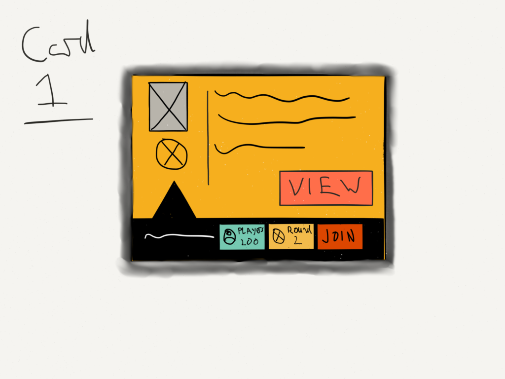
Wireframes & prototypes: Switched to card-based layouts, prioritized graphs and isotype feedback.
Visual design system: Borrowed best cues from the Cover5 app—clean, bold visuals and clear navigation.
-
Testing
Usability testing: Fans tested new layouts during live games—flagged slow loads and hidden info.
User feedback: Iterated card layouts, tweaked summary panels, and made everything easier to scan.
Design iterations: Kept refining based on real-world usage and feedback.
-
Implementation
Handoff process: Delivered annotated wireframes and design system to devs.
Development collaboration: Weekly sprints to ensure live updates and smooth transitions.
Go-to-market strategy: Rolled out to active users with in-app prompts and a blog post.
-
Results & Impact
Metrics & KPIs: Faster info retrieval, more contests joined per user, higher session times.
User adoption: Fans loved the new visuals and quick stats—more engagement during live games.
Business impact: Higher retention, more contests played, and positive feedback from both casual and hardcore users.
Lessons learned: Visuals and clarity matter most—especially for fans who never take their eye off the game.
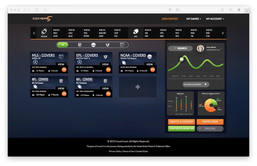
Cover5 is an Online sports games for casual fans and die-hard fanatics. Simply pick 5 teams and score points, when they beat the spread or get punished when they don’t. Cover5 creates excitement for any game and any sporting event, allowing all sports fans to enjoy the game in the way they’re meant to be experienced.
I had been contacted to look at improving the cognitive load and user flow of the site’s dashboard and selected contests within the site. As it was clear that more sports, leagues, and people will be playing more games. Clearly defined areas needed to be created.
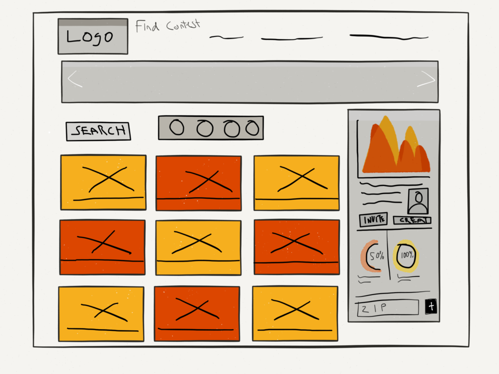

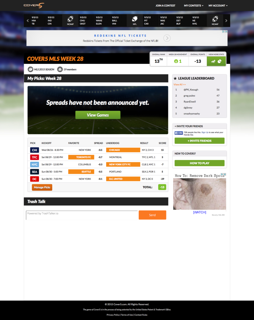
The research found that users wanted graphs and Isotype data feedback on the contests they were part of, users demand a visual aspect to their information. This was addressed aligning the right-hand panel with an overall summary on the dashboard page and a contest specific data display on the chosen contest page.
User Research concluded that users use the site with one eye on the TV and the other on the site at game time. Using cards that displayed relevant information allowed for a better affordance level.

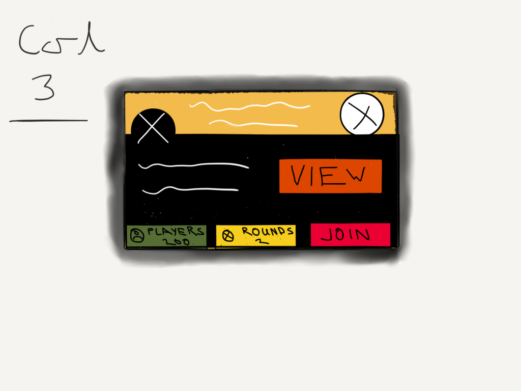


I took a lot of my design cues from the current Cover 5 Apps, as I felt they have a better look and feel.