Bublup App
-
Introduction
Brief: Redesign Bublup’s My Feed and notification system to be genuinely useful, not annoying.
Challenge: Notifications were noisy and My Feed cluttered—users missed what mattered.
Goals: Make key updates visible at a glance, minimize distractions, and streamline sharing/saving.
-
Discovery Phase
Stakeholder interviews clarified the need for a less intrusive, more actionable notification system.
Business requirements: Keep users engaged without overwhelming them.
User needs assessment: Users want timely, relevant updates—no constant interruptions.
-
Problem Framing
Problem statement: Users struggle to find important updates and are frustrated by notification overload.
Success criteria: Users can easily customize and act on notifications, and My Feed feels clean and relevant.
Constraints & assumptions: Must work across desktop and mobile; can’t interfere with core app functionality.
-
User Research
User interviews: Most users valued trending topics and suggestions but hated constant pop-ups.
Competitive analysis: Looked at how other apps handle notifications and feeds.
Market research: Found that customizable, subtle notifications drive higher engagement.
-
Synthesis
User personas: Social sharers, power users, and casual browsers—all wanted control over their feed.
Journey mapping: Mapped paths from new notification to action (sharing, saving, dismissing).
Key insights: Users want to filter alerts, set triggers, and never lose focus on their task.
-
Solution Development
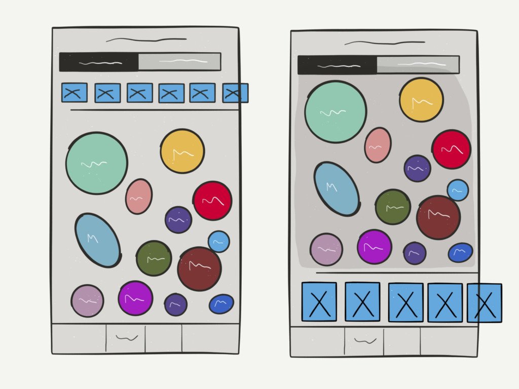
Information architecture: Unified trending, suggestions, and notifications in one customizable feed.
Wireframes & prototypes: Explored top-down notifications, persistent sidebar, and in-feed alerts.
Visual design system: Small, unobtrusive notifications; animated feedback for sharing/saving.
-
Testing
Usability testing: Users preferred unified My Feed and subtle alert animations.
User feedback: Iterated on notification size, placement, and customization options.
Design iterations: Refined sharing/saving flows for clarity and speed.
-
Implementation
Handoff process: Delivered annotated designs and specs to dev team.
Development collaboration: Worked closely to ensure notifications blended seamlessly with site UI.
Go-to-market strategy: Soft launch, followed by user feedback loop and phased rollout.
-
Results & Impact
Metrics & KPIs: Higher My Feed engagement, lower notification opt-out rates.
User adoption: More users customized their feeds and acted on recommendations.
Business impact: Increased retention and positive feedback on the new system.
Lessons learned: Subtlety and control are key—users value notifications when they’re relevant and non-intrusive.
The users My Feed section was originally intended to have a better usability in order to help the user experience of the app, but in general, that’s not always been the case in practice since notifications can quickly become an annoyance if they’re designed poorly or not managed properly.
This was the challenge when creating an experience for the
Bublup app, Bulblup is ground-breaking technology that changes how people interact with information and with each other.
I had been asked to consult on the My Feed section and more importantly address how users notifications would be handled.
Thanks to their prevalence, it’s easy to take notification endorphin induced design for granted, which usually leads to unsatisfactory UX.

Notifications should always be as unobtrusive as possible. They shouldn’t interfere with what task the user needs to accomplish at any time, yet they should obviously still achieve their intended purpose of letting users know of something important, that the user has asked to be notified about.
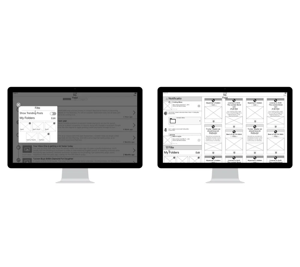


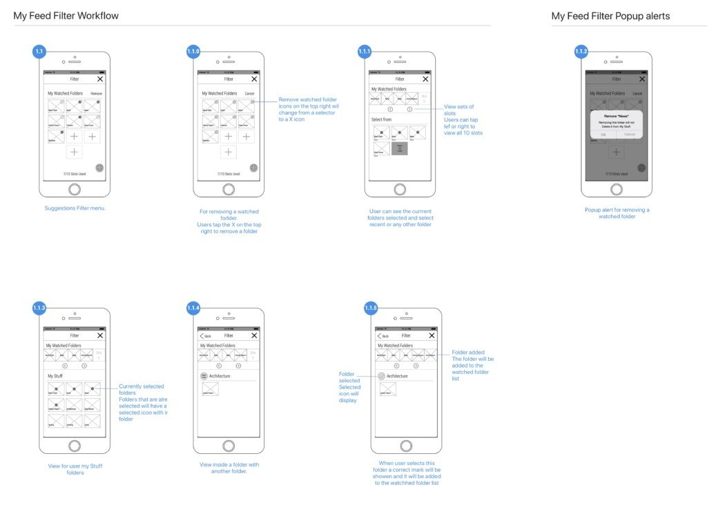


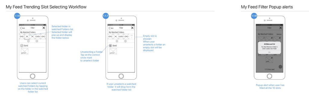


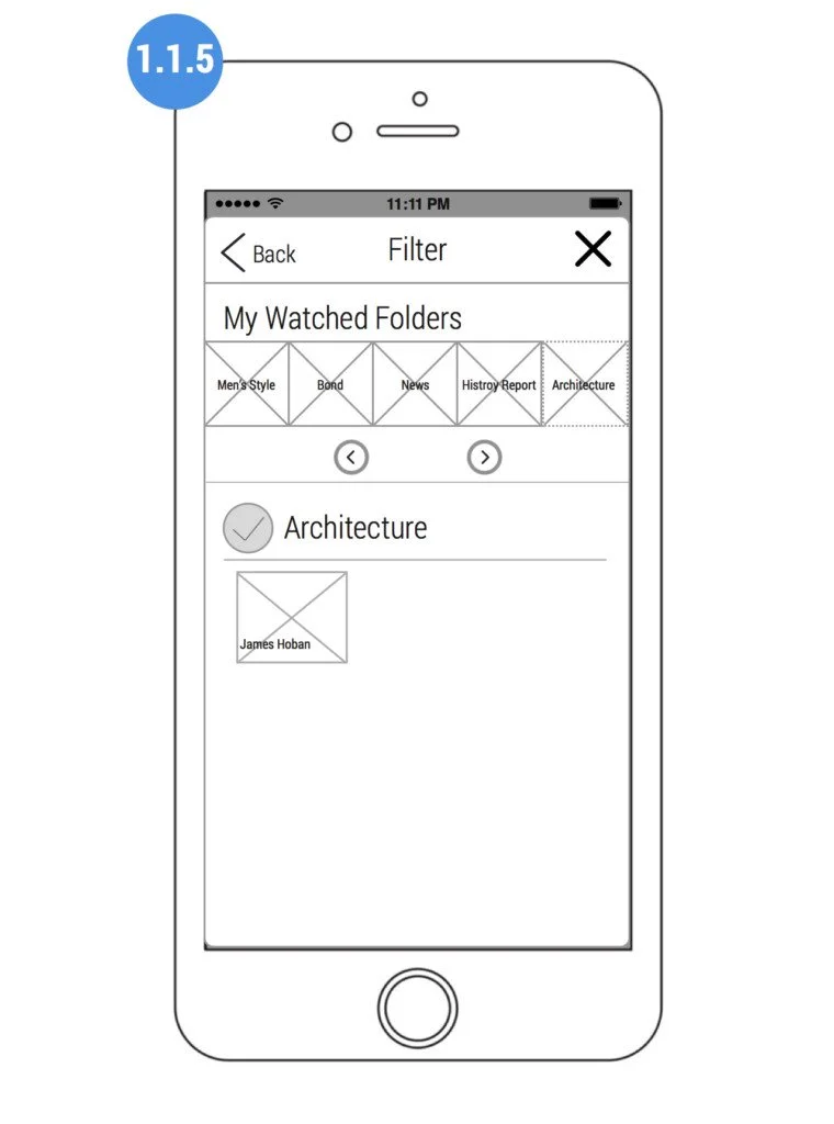


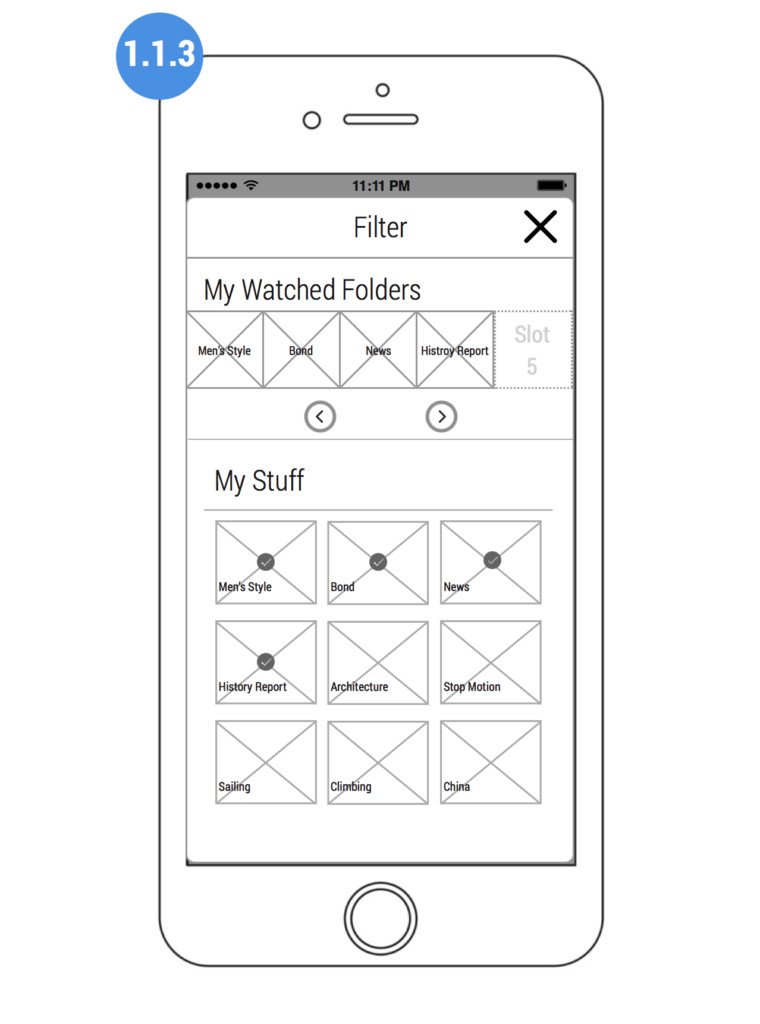


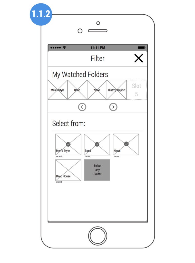
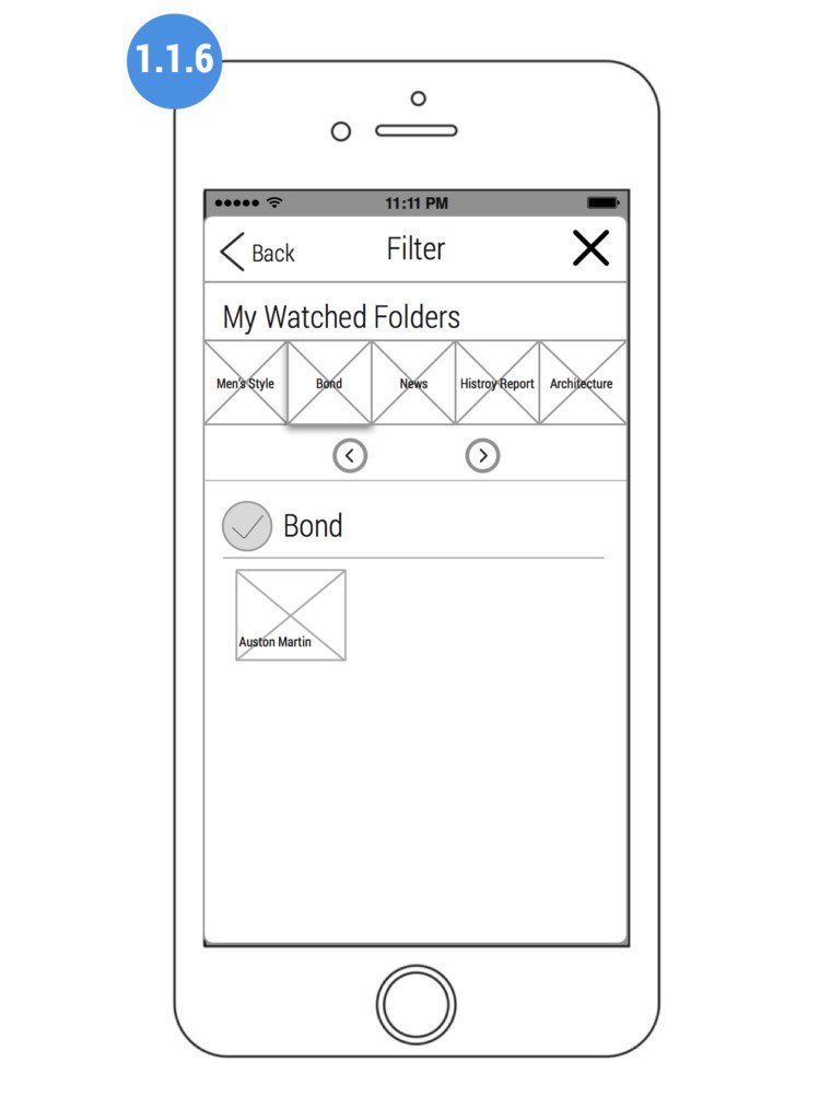
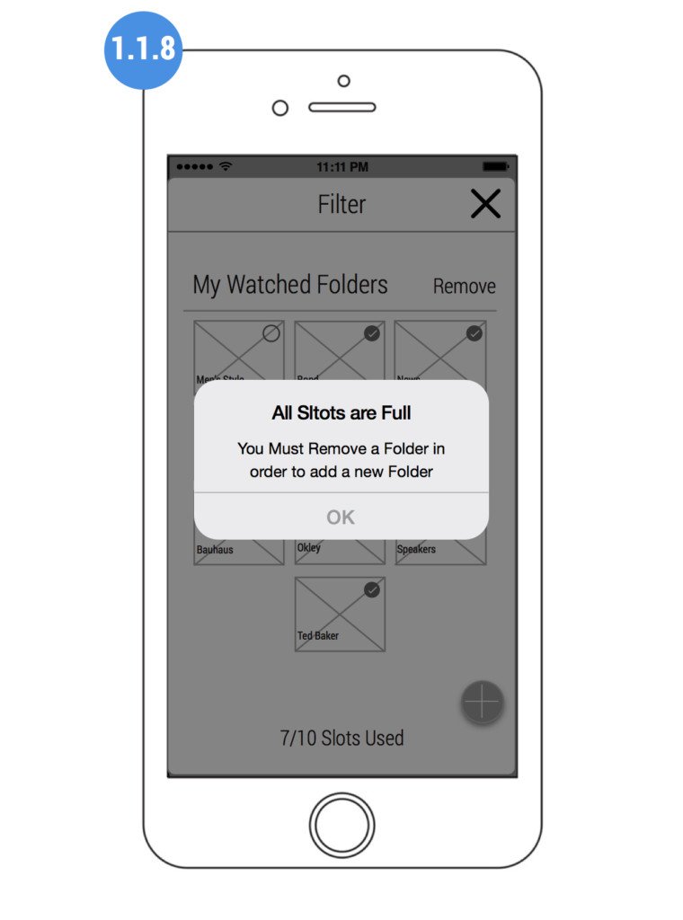
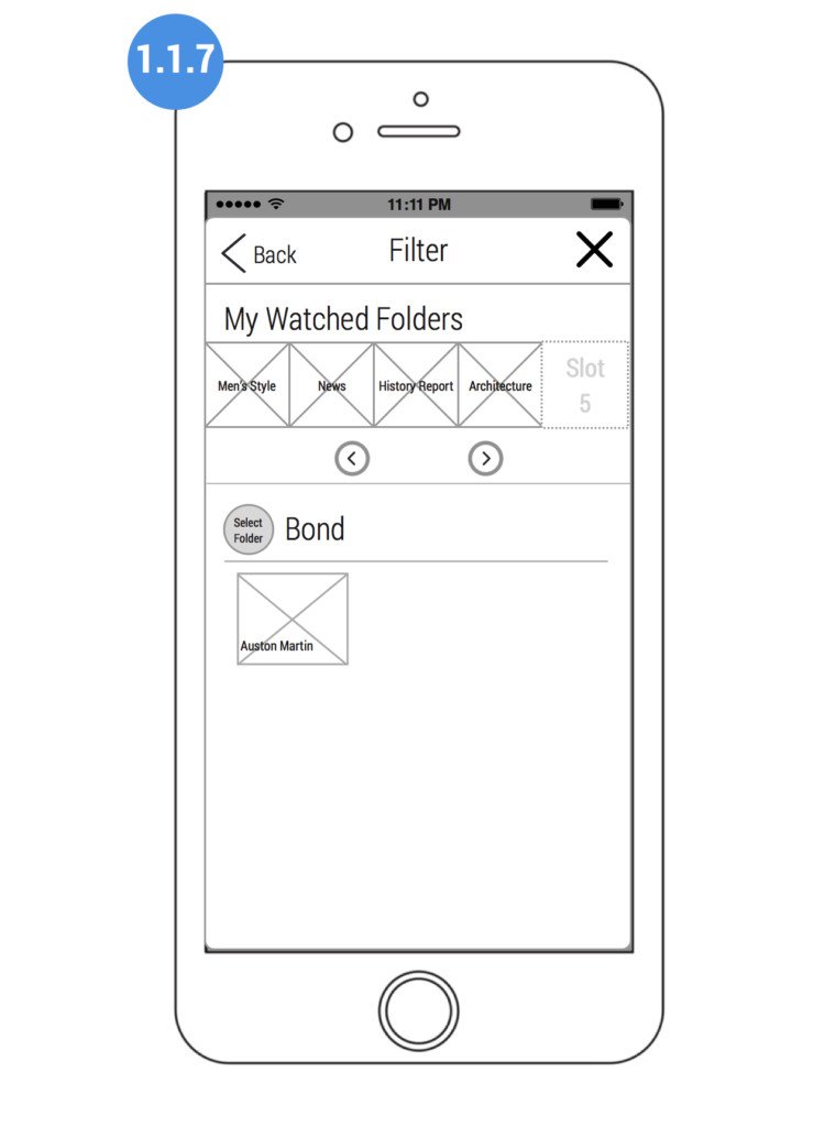

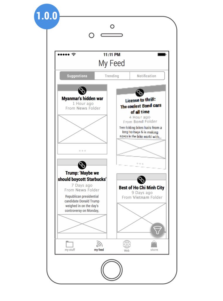
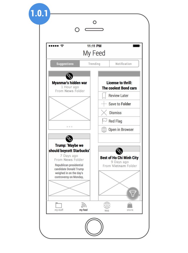

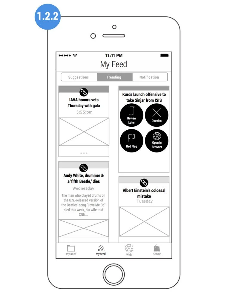

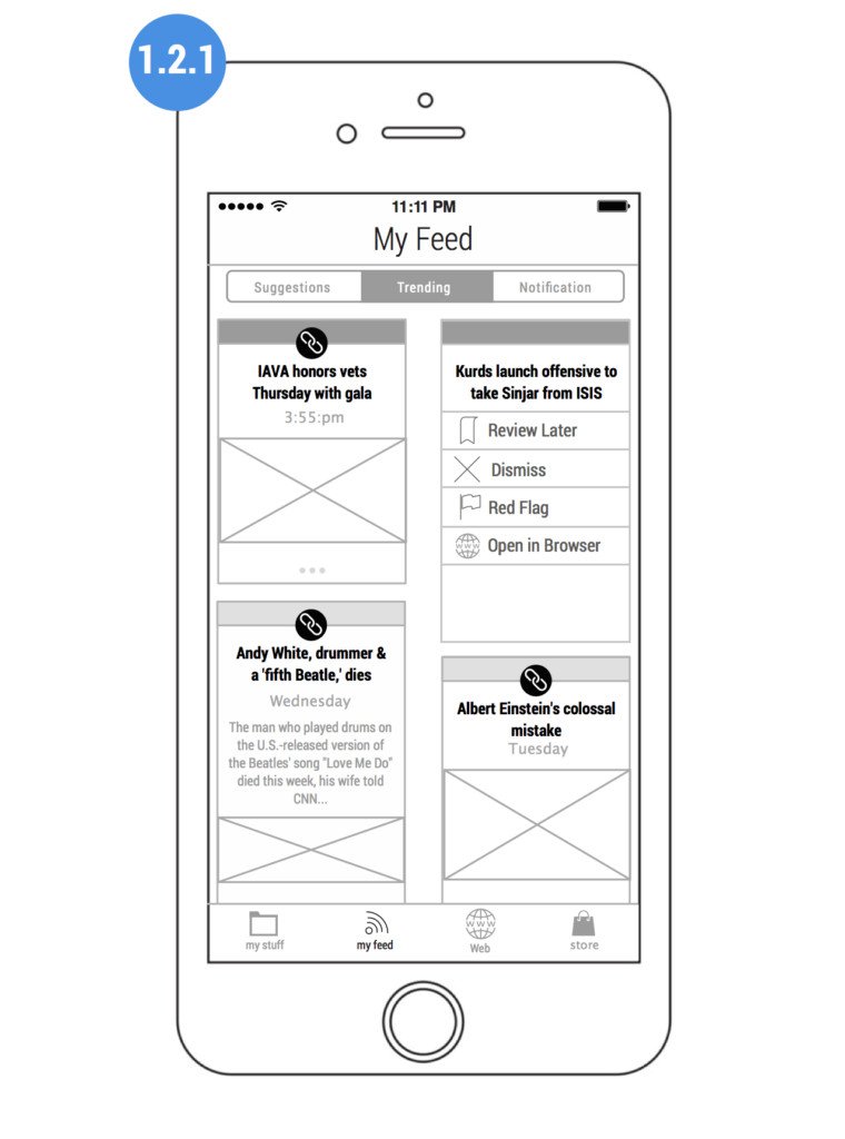
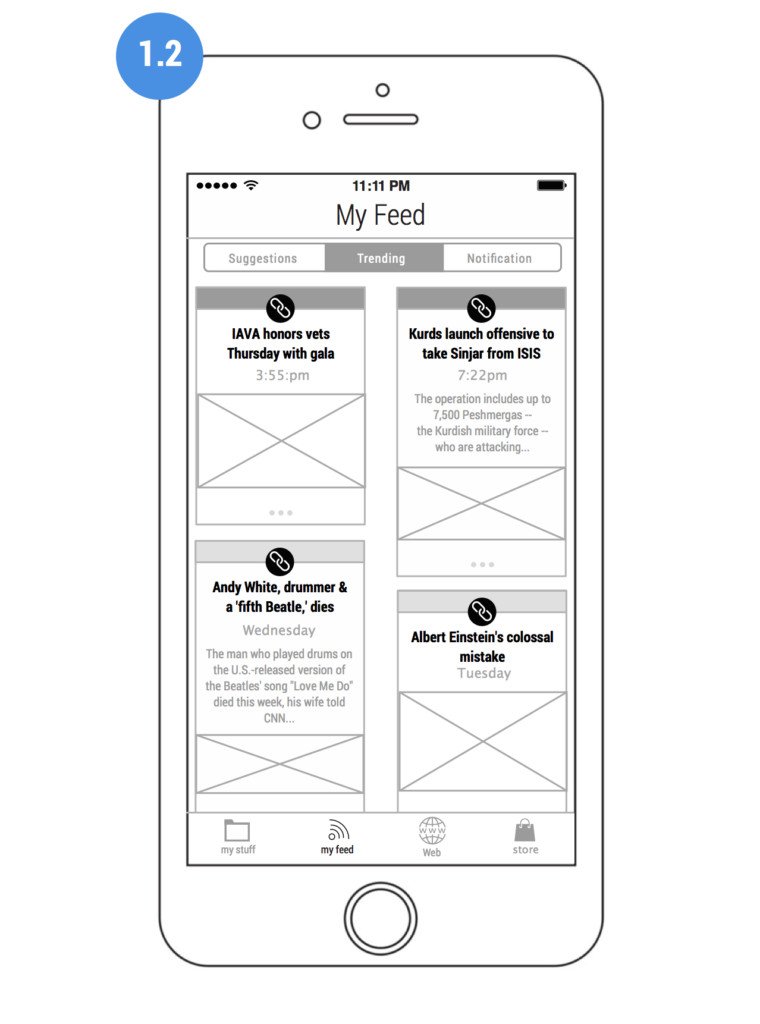
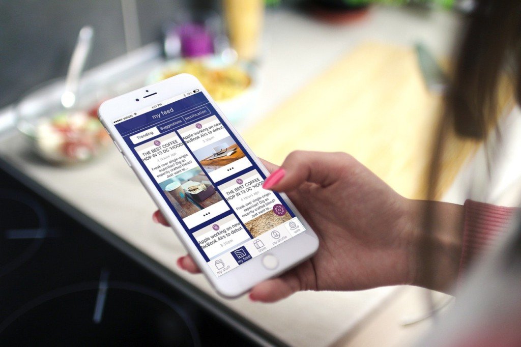
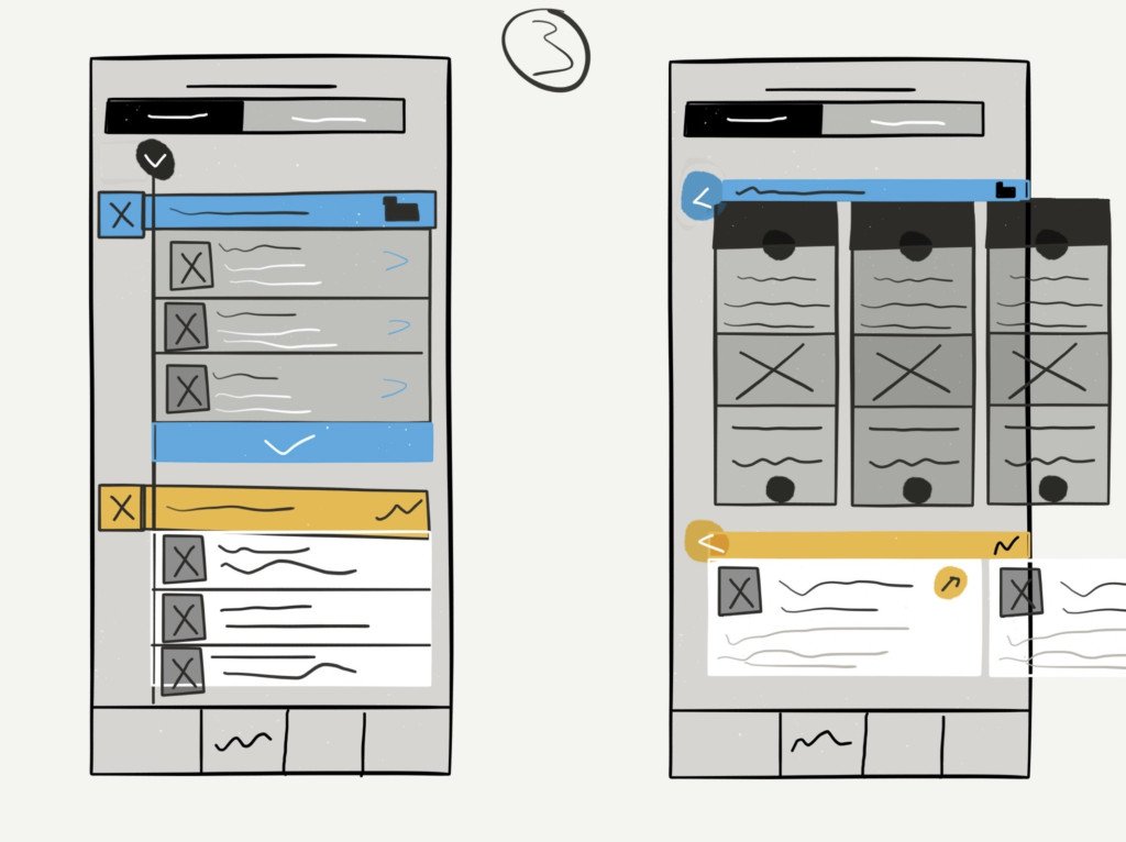
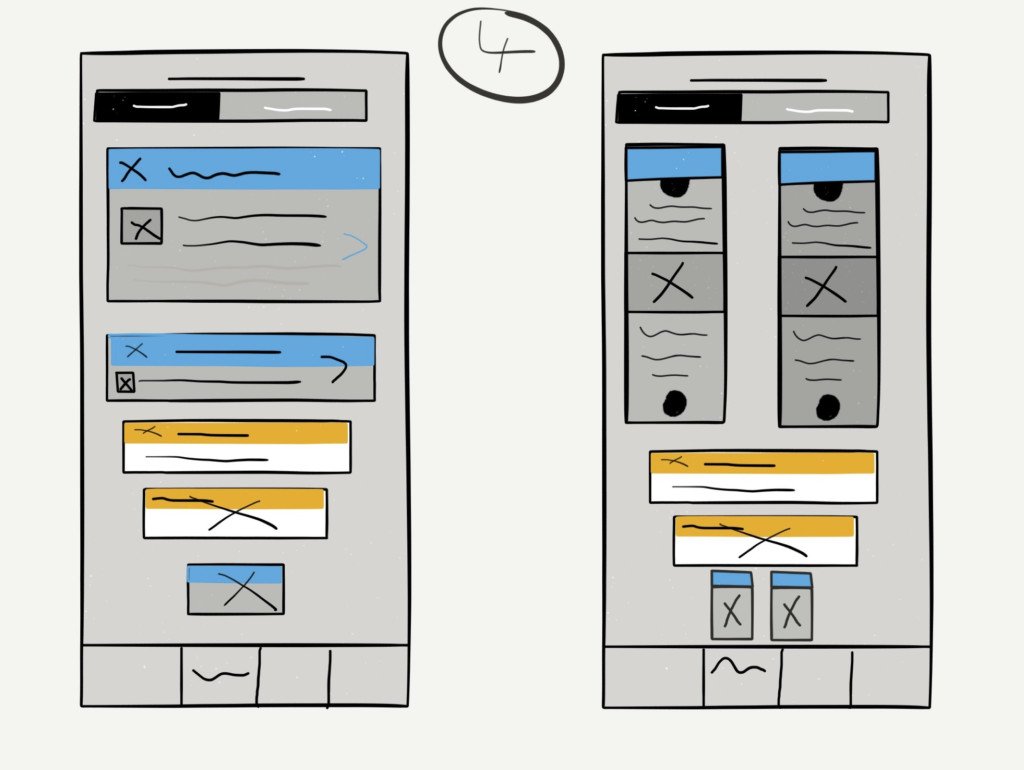
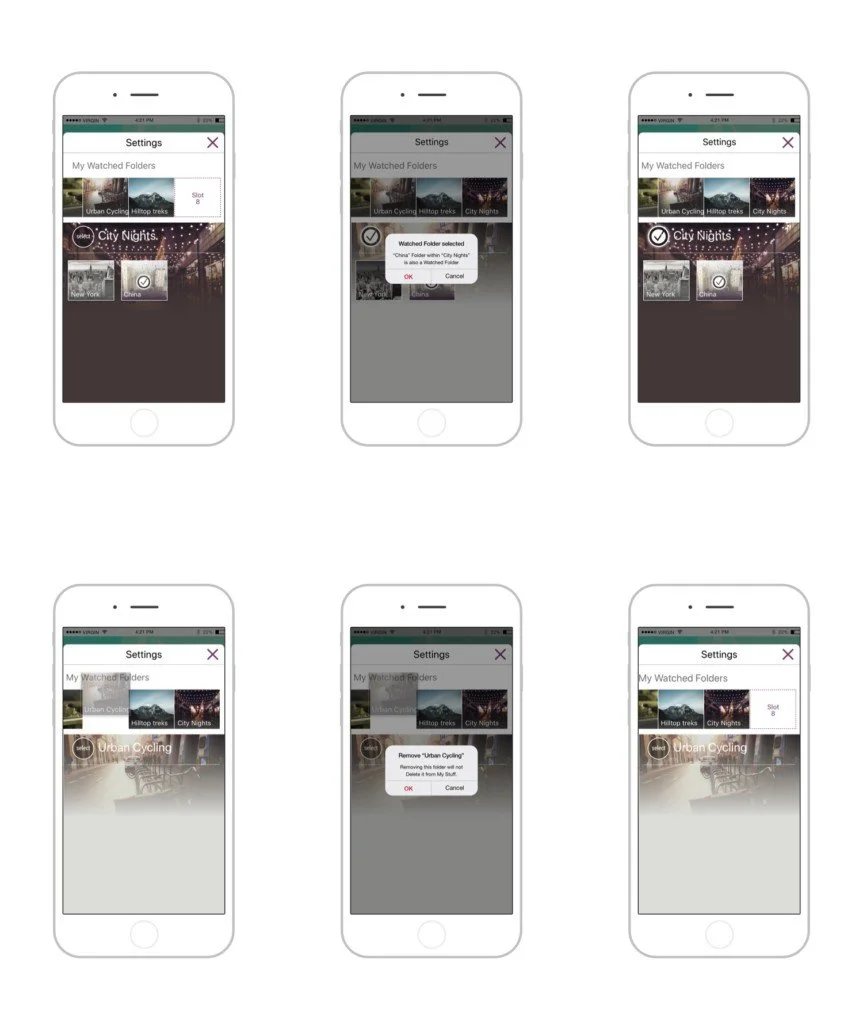
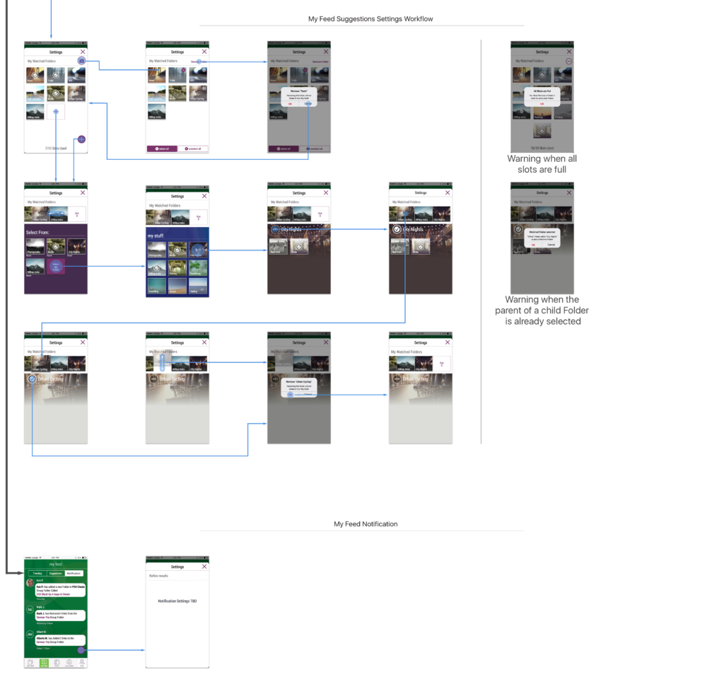
That’s is why the approach of the My Feed section to have the most common notifications users receive, placed in the My Feed section. This included trending, suggestions, and notifications.
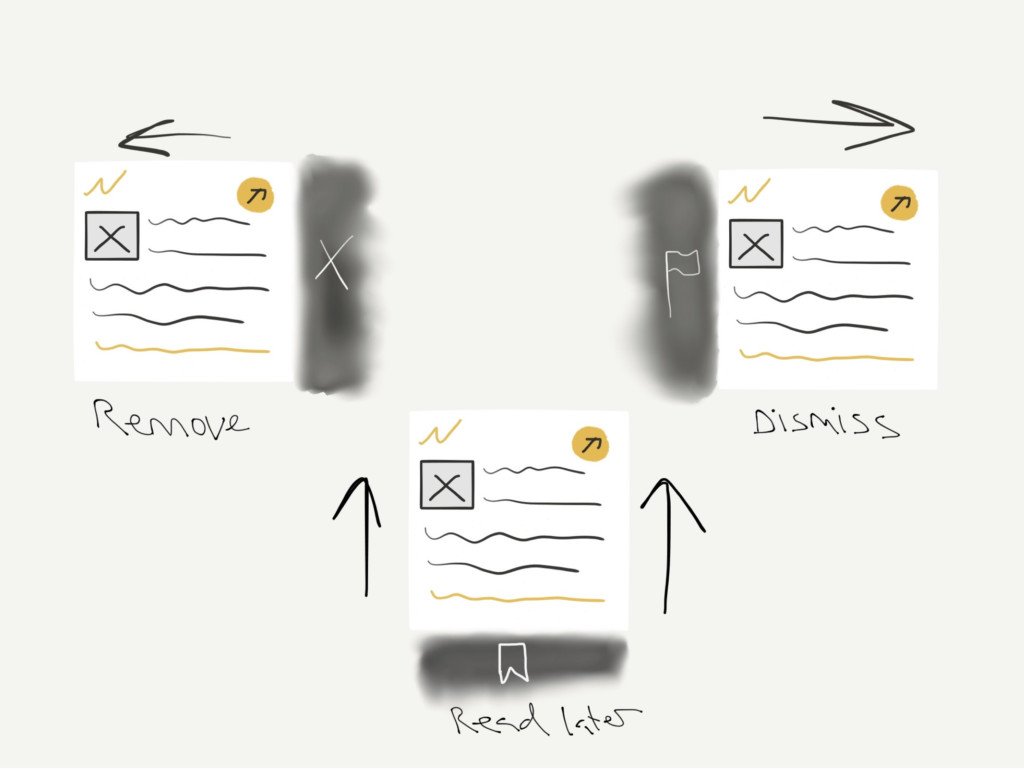
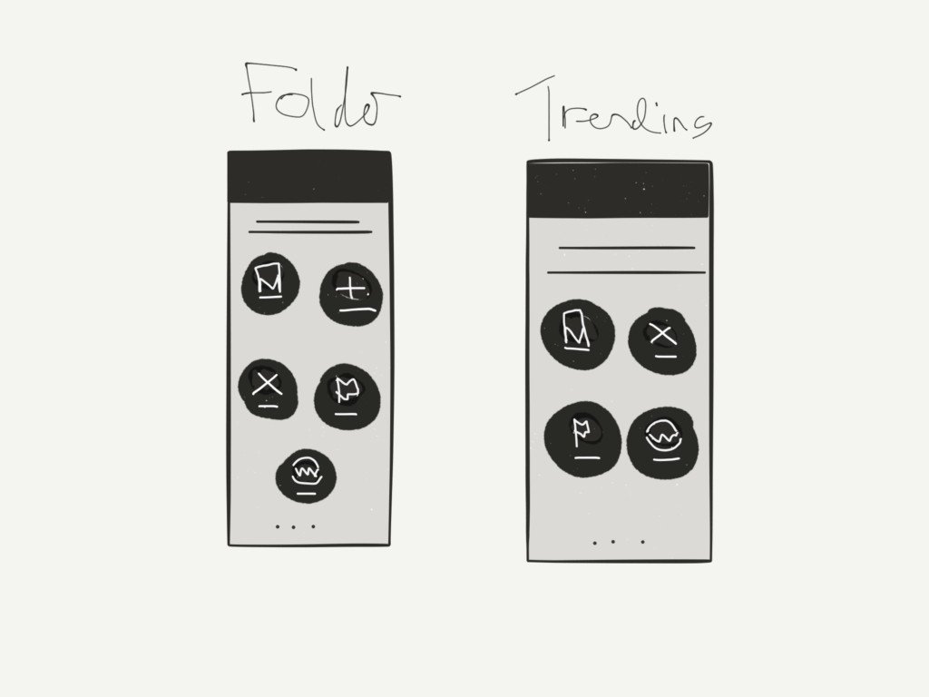
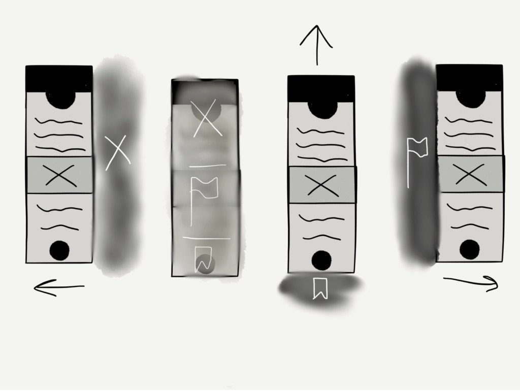
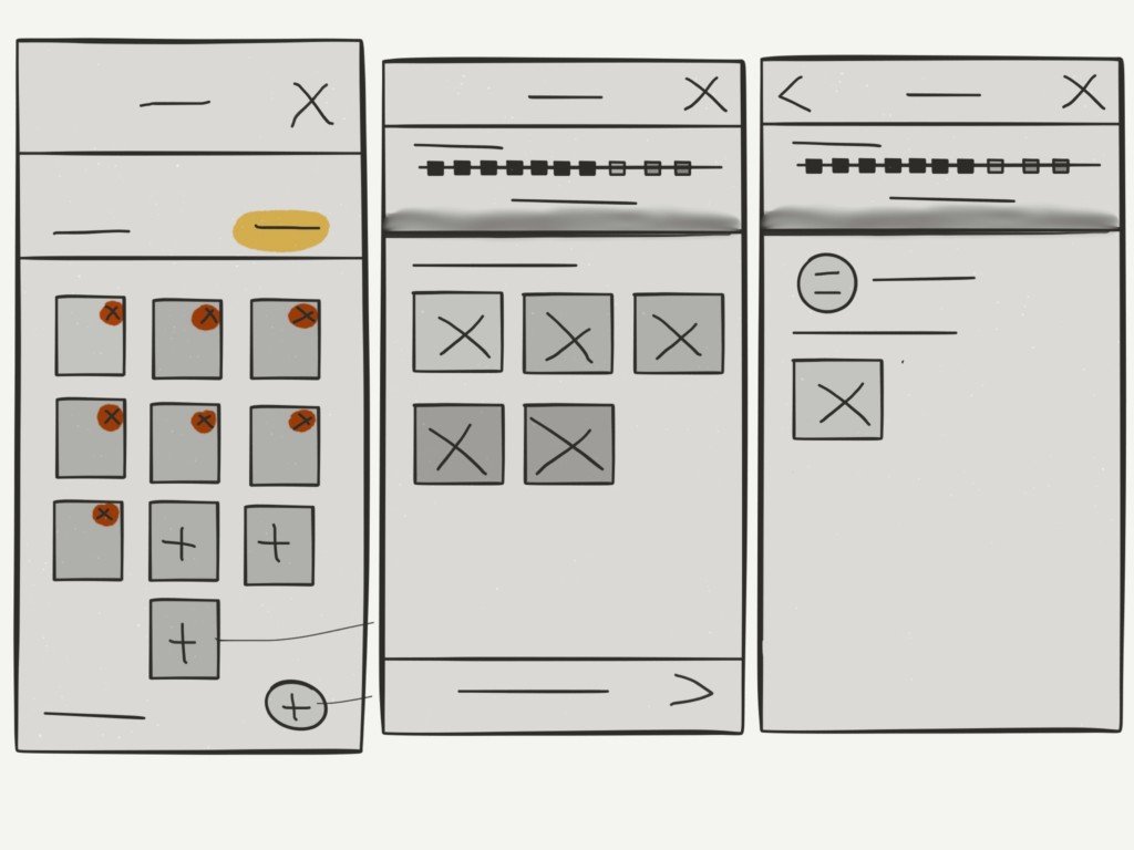
The user can edit these sections and receive notifications as they happen or when certain tagged words are found or if a preset number of links have been collated, the My Feed section sends small notifications that slide in at the top down of the screen. Although they’re small, the user will always see them because the movement catches the eye, and their importance and order means that they’ll never obstruct the user with every single notification.
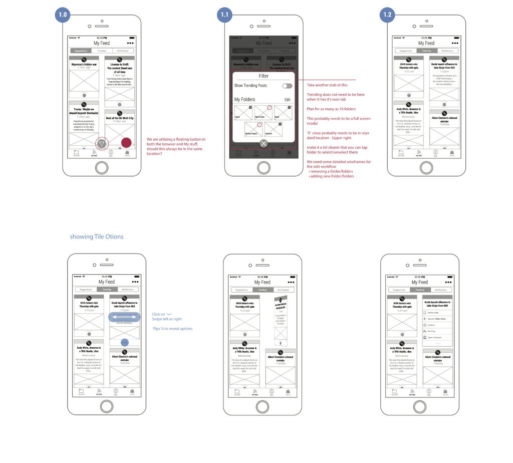


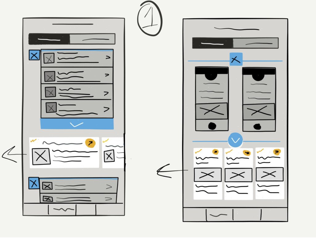
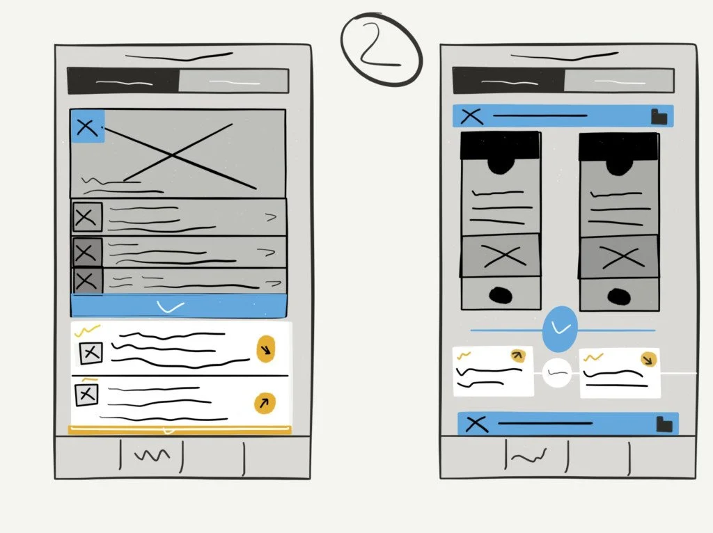
The second issue I was asked to address was what and how the user saved or shared the links they found. this was done with a number of animations as to how the share and storing options were made aware to the user.