Washington D.C. Merto ticket machine Redesign
-
Introduction
Brief: Redesign the ticket machine UI for the D.C. Metro to make topping up and buying tickets less confusing and stressful.
Challenge: Outdated, unclear UI and awkward physical interactions led to user frustration and safety concerns.
Goals: Shorten transaction time, reduce user confusion, and make the process safer for everyone.
-
Discovery Phase
Stakeholder interviews with Metro riders and station staff.
Business requirements: No hardware changes—just UI/software updates.
User needs: Fast, clear, and safe ticketing, especially for new users and tourists.
-
Problem Framing
Problem statement: Most users struggle to complete a transaction due to poor UI, vague feedback, and unclear options.
Success criteria: Users can buy or top up in under a minute, with clear feedback at every step.
Constraints: No hardware changes; must work for all rider types.
-
User Research
User interviews and field observations at busy stations.
Competitive analysis: Compared with ticketing flows in NYC, London, and Paris.
Market findings: The best systems use minimal steps, clear visual feedback, and prioritize the contactless card flow.
-
Synthesis
Personas: “The Daily Commuter,” “The Confused Tourist,” “The Distracted Parent.”
Journey mapping: From approaching the machine to leaving with a ticket or topped-up card.
Key insights: Users want to start with their card, see immediate feedback, and always know what’s next.
-
Solution Development
Info architecture: Centered the process around tapping the Smartrip card first.
Wireframes & prototypes: Reduced options, bigger buttons, clear progress states.
Visual design: Added prominent CTAs, feedback for payment errors, and simplified navigation.
-
Testing
Usability testing with real riders (commuters and tourists).
User feedback: Simplified menus, clearer payment instructions, improved error messages.
Iterations: Refined flow to reduce cognitive load and added more obvious prompts.
-
Implementation
Handoff: Annotated wireframes and UI specs to Metro’s dev team.
Dev collaboration: Regular check-ins to ensure smooth rollout and bug fixes.
Go-to-market: Piloted at key stations, then rolled out system-wide.
-
Results & Impact
Metrics: Faster transactions, fewer abandoned attempts, lower support requests.
User adoption: More people using self-service, less reliance on staff.
Business impact: Better rider experience, improved station flow.
Lessons learned: Prioritize the user’s natural flow, minimize steps, and give constant feedback.
This was a problem that scratched that part of my mind that does not allow condition. While I had been living in the nation’s capital I used the D.C. Metro system on a day to day basis. Topping up the metro card was a painful user experience.
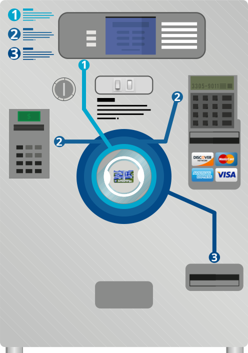
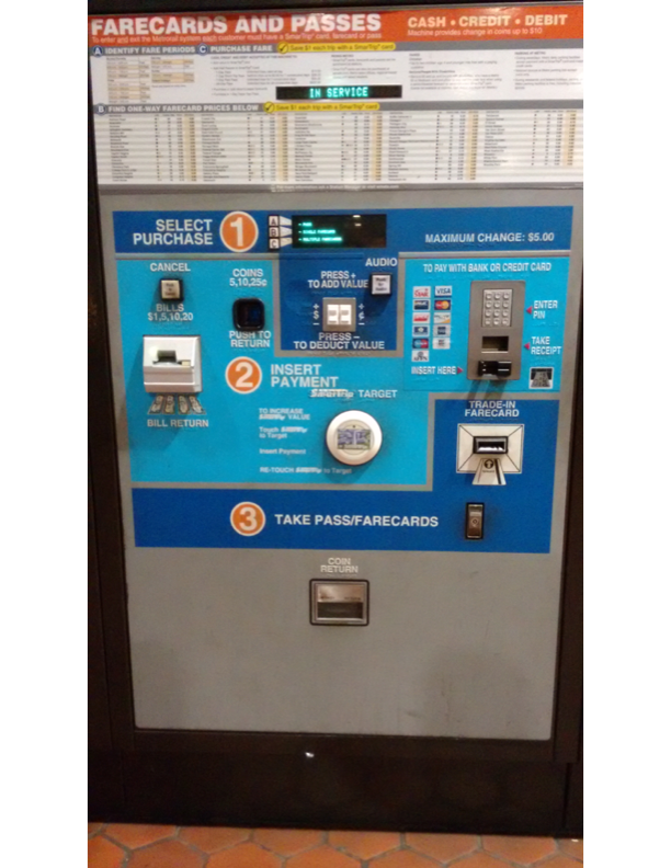
The machine welcomes you with three steps in order to punch or tops up your ticket: select purchase, insert payment and take ticket/farecard. The limited UI of the machine displays three options: Pass, Single farecard and multiple farecards. Looking at the screen you may find that UI doesn’t look like something you can interact with as there are no UI elements that would look like buttons and I’ve seen people walking away with no clicking at any option given.
Pressing A, B, or C buttons back and forth gives you quite similar looking screens, providing no clear information about their difference. Inserting a bill fails with no reason given. It just gives it back. One bill after another. Using a changing machine makes no difference – it rejects the bills.
The Satisficing and progressive disclosure load on the user is very high from the use of the Metro Smartrip card to the lurches of a single ticket. When a user needs to top up a smart card the user must hold the card to the contactless panel with one hand and then insert money with the other hand. This can cause a serious personal safety issue as homeless people have can come up and ask for money and distract you. If contact is lost at any time during the process the transfer of credit to the card is paused on the user’s account and no receipt is given, users must call the support line and register the card.
I could describe all the other failures of trying to buy a ticket in details, but I’d rather save your time.
It would seem that it is designed to make the process of buying tickets faster and easier, however I’ve found most people stand in line totally overwhelmed when faced with the machine in front of them and confused as to the process and waiting in an “old school” way to buy tickets or going through the process with a human operator while other machines stand idle.
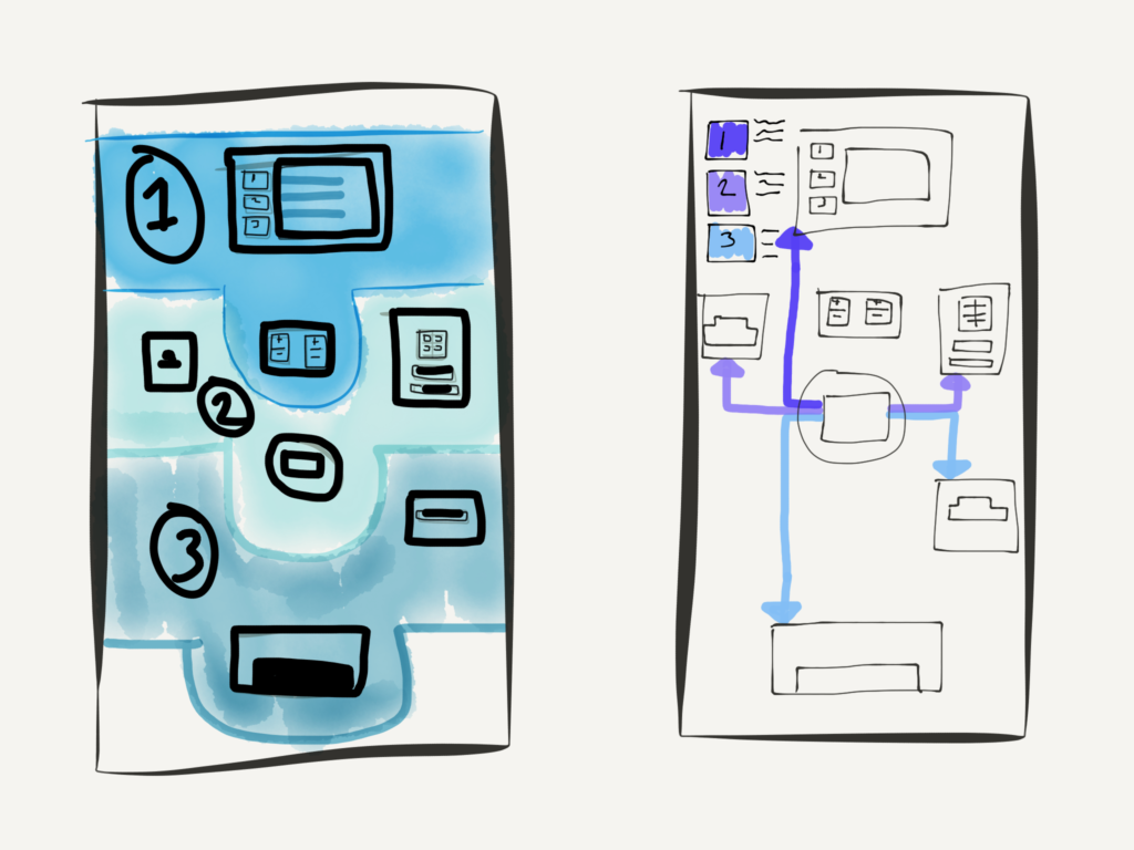

In order to improve the pain points of buying and topping up metro cards, I needed to look at the layout process on the machine, while I felt replacing or rearrange inputs on the machines would affect the user experience retrofitting all the machines in the D.C. Area would be a non-runner. I looked at removing a large amount of the information on the machine and centering the user’s first process by making contact with the contactless Smartrip card.