Rio Tinto
Commercial Markets Desk
-
Introduction
Brief: Digitize and streamline order management for Rio Tinto’s Commercial Markets Desk.
Challenge: Replace clunky, paper-heavy workflows with a modern, easy-to-use digital portal.
Goals: Make order entry, tracking, and trade analysis lightning-fast and transparent for traders and CSRs.
-
Discovery Phase
Stakeholder interviews: Product leads, traders, and CSRs flagged pain points with manual processes and Excel-based systems.
Business requirements: Centralized dashboard, error handling, and multi-product support (Aluminium, Marine).
User needs assessment: Fast, familiar tables, mobile access, and live updates.
-
Problem Framing
Problem statement: Users lost time and trust juggling paper, email, and spreadsheets—errors and missed trades were common.
Success criteria: Orders and quotes tracked in real time, error states are clear, and mobile/desktop parity.
Constraints & assumptions: Must feel familiar to existing users, scale for new products, and work live.
-
User Research
User interviews: Shadowed traders and CSRs in the office and at ports.
Competitive analysis: Looked at other trading and order management tools.
Market research findings: Card-based dashboards and swimlanes speed up scanning and action.
-
Synthesis
User personas: “The Desk Trader,” “The CSR Multitasker,” and “The On-the-Go Manager.”
Journey mapping: From dashboard scan to placing a new order, tracking status, and reconciling trades.
Key insights: Users need quick overviews, clear status, and error feedback—especially during busy trading.
-
Solution Development
Information architecture: Three-tier taxonomy for tables, centralized dashboard, and card-based layouts.
Wireframes & prototypes: Explored card/swimlane views, mobile-first screens, and error flows.
Visual design system: Consistent with Rio Tinto’s DS, bold status indicators, and heads-up display elements.
-
Testing
Usability testing: A/B tested dashboards, ran live sessions with traders and CSRs.
User feedback: Card view and swimlanes preferred for quick scanning; PDF downloads eased transition from paper.
Design iterations: Refined error banners, added audit history, and improved mobile navigation.
-
Implementation
Handoff process: Annotated wireframes and design system delivered to dev team.
Development collaboration: Weekly sprints, tight QA, and real-world feedback loops.
Go-to-market strategy: Soft launch with power users, then rolled out to the wider team.
-
Results & Impact
Metrics & KPIs: Faster order entry, reduced errors, higher mobile usage, and more trades managed per user.
User adoption: Positive feedback from traders and CSRs—mobile access was a big win.
Business impact: Increased transparency, fewer missed trades, and better audit trails.
Lessons learned: Familiar UI patterns + real-time feedback = less stress and more trust for busy trading desks.
The CMD Portal is a custom-built platform, serving as an order book and trade blotter, aimed at enhancing the transparency of internal hedge orders for the Commercial Markets Desk team. This intuitive system is meticulously crafted to accommodate various products as distinct modules, with the current framework including specialized support for both Aluminium and Marine products.
Features
Self-service Quotation Functionality for LME Aluminium
Centralized dashboard and live order/trade blotter
Database of orders and trades for trade performance analysis
Automated notifications of order statuses to CSRs and traders
Mobile and Desktop applications are available
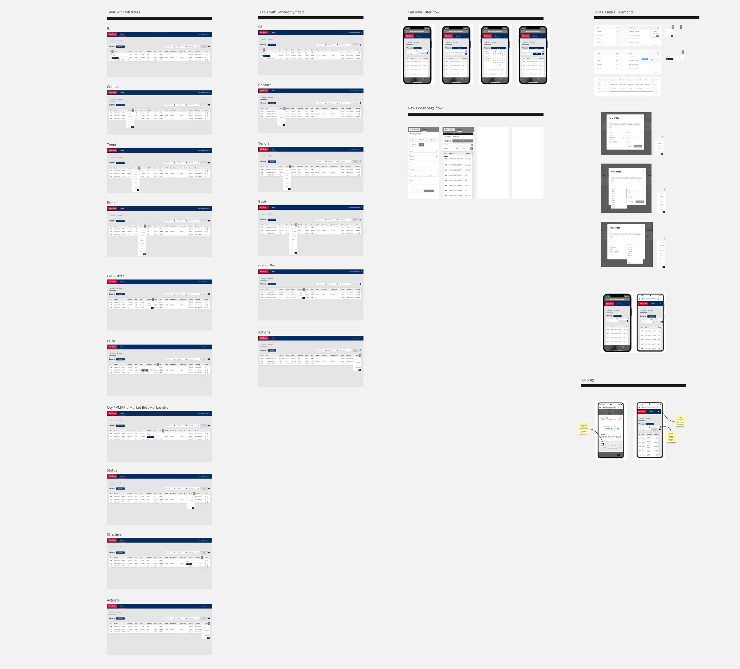
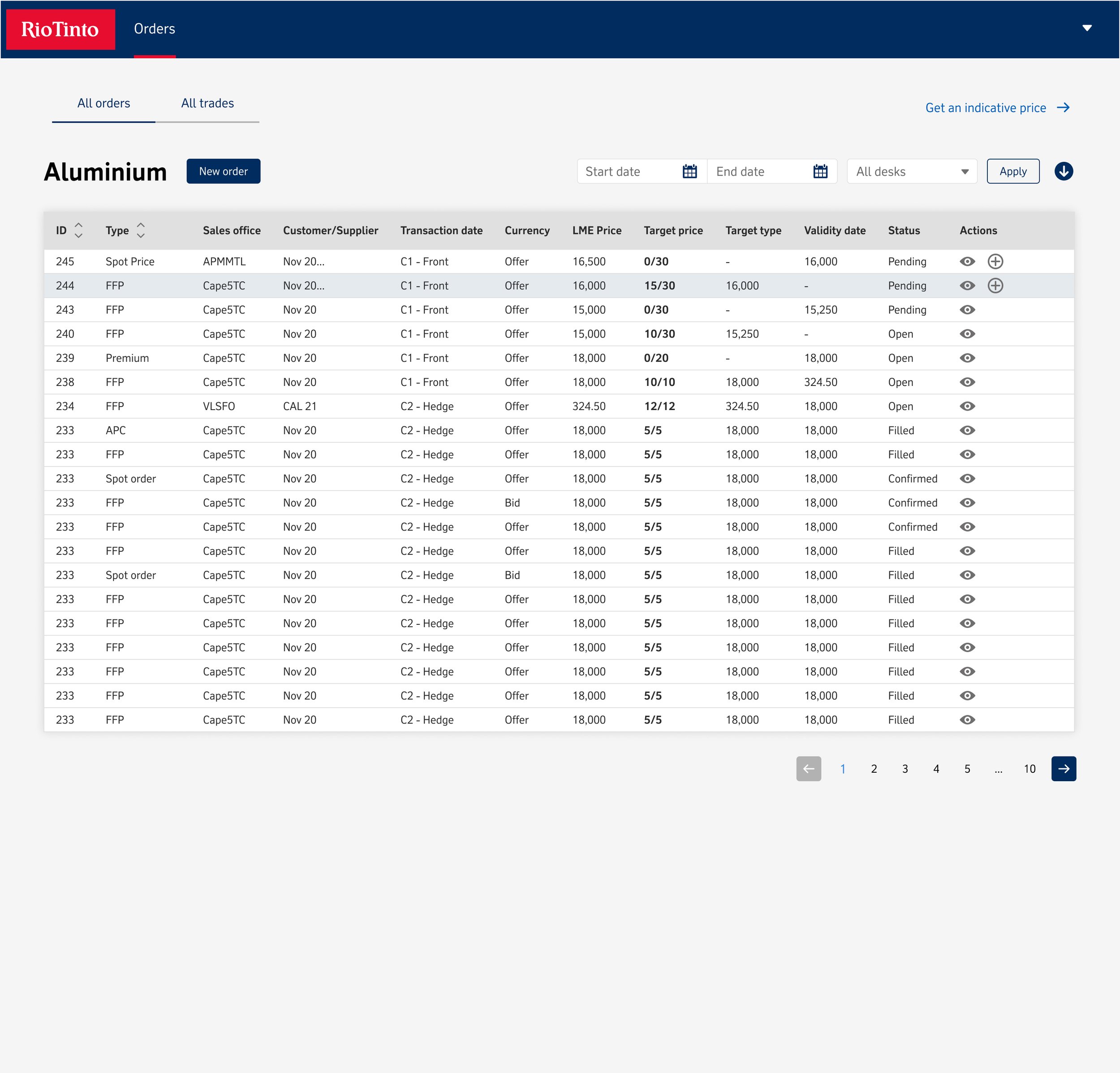
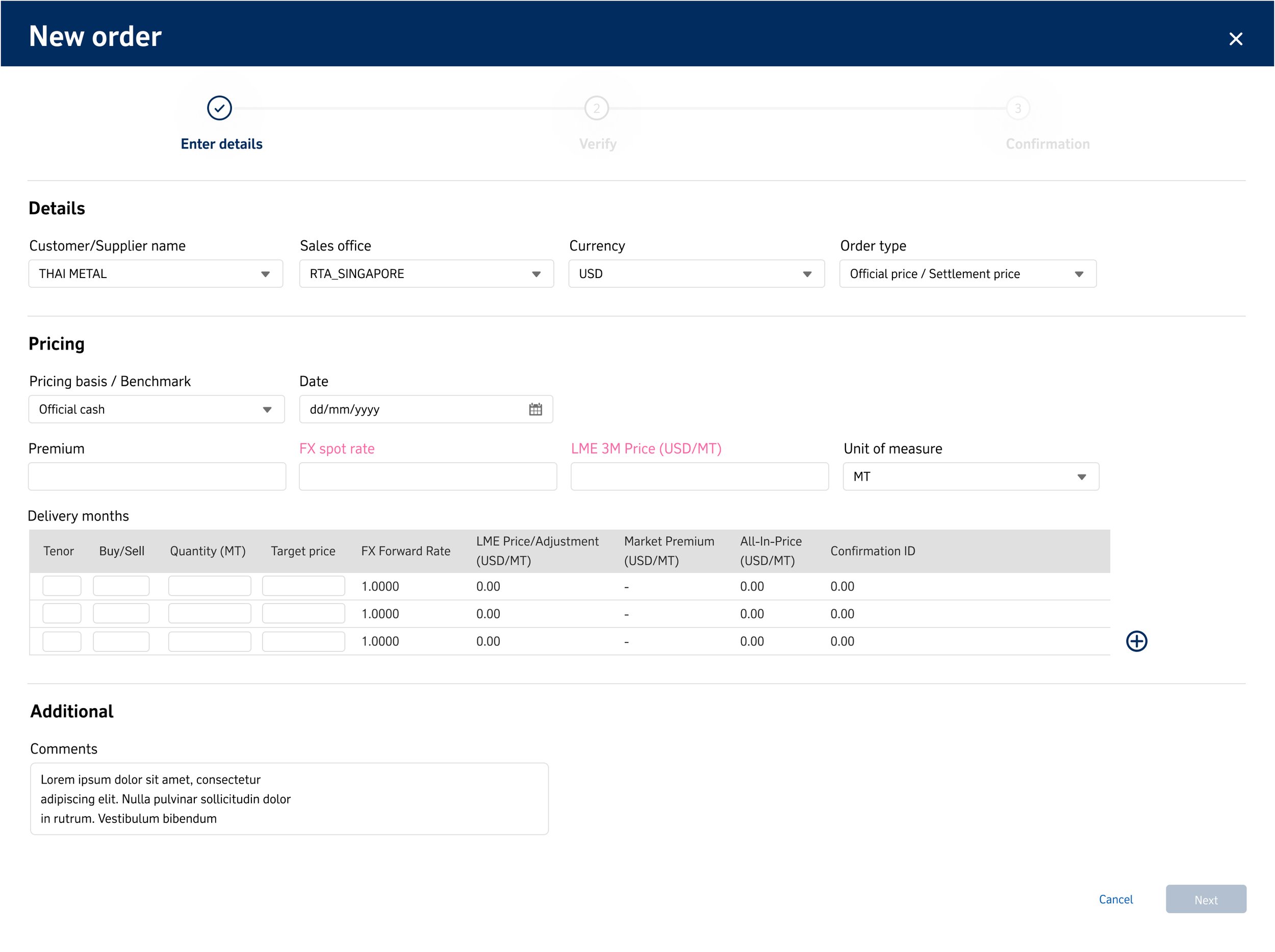
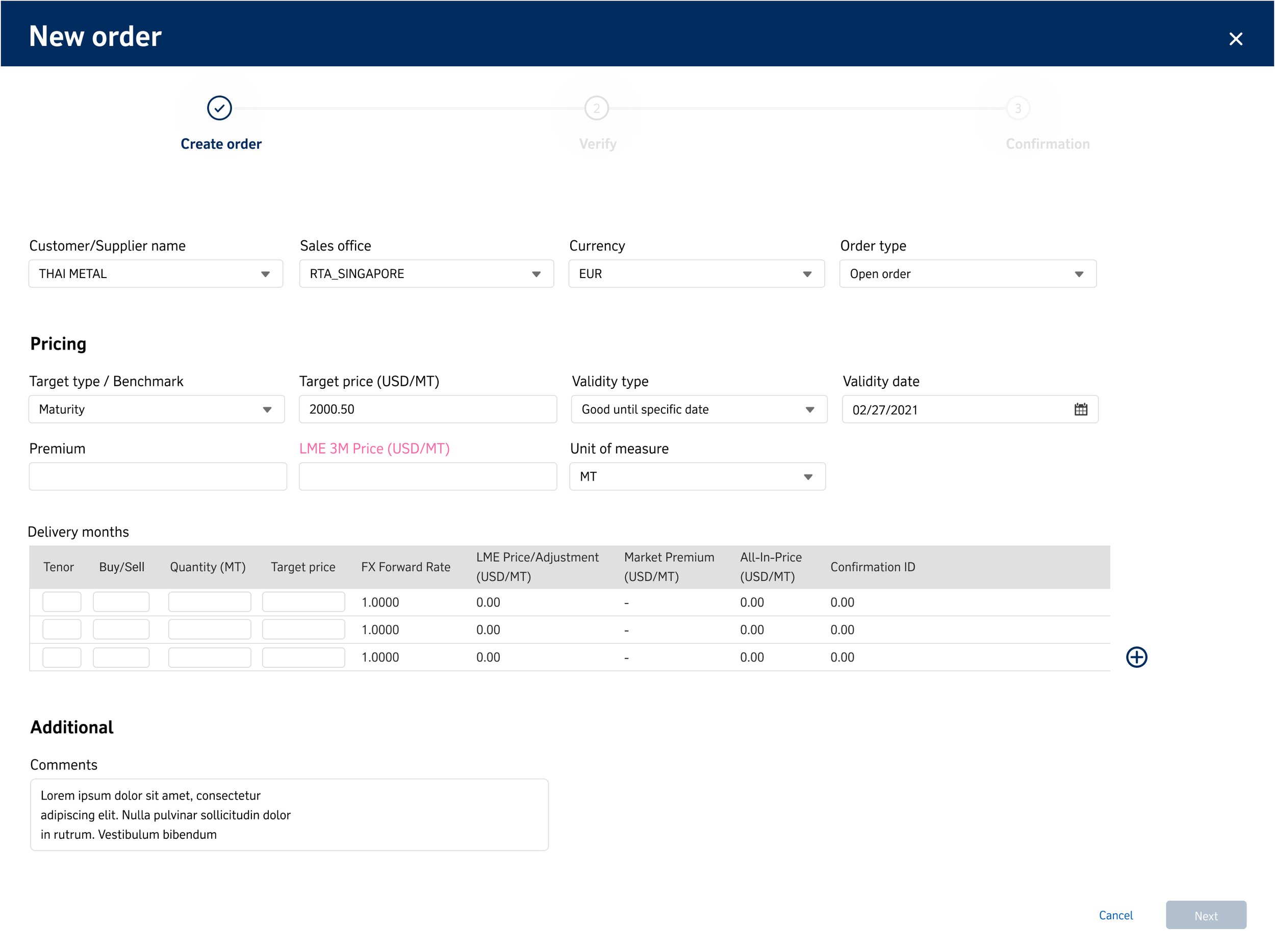
When tasked with constructing a system of significant levels and complexity that operates in a live environment, it became crucial to devise a standard locus of control for the interface. This involved integrating a high usage of tables, for which a structured taxonomy was essential. Consequently, three tiers of taxonomy were introduced, comprising high to low categorization, the incorporation of radio buttons for section selection, and an efficient search functionality.
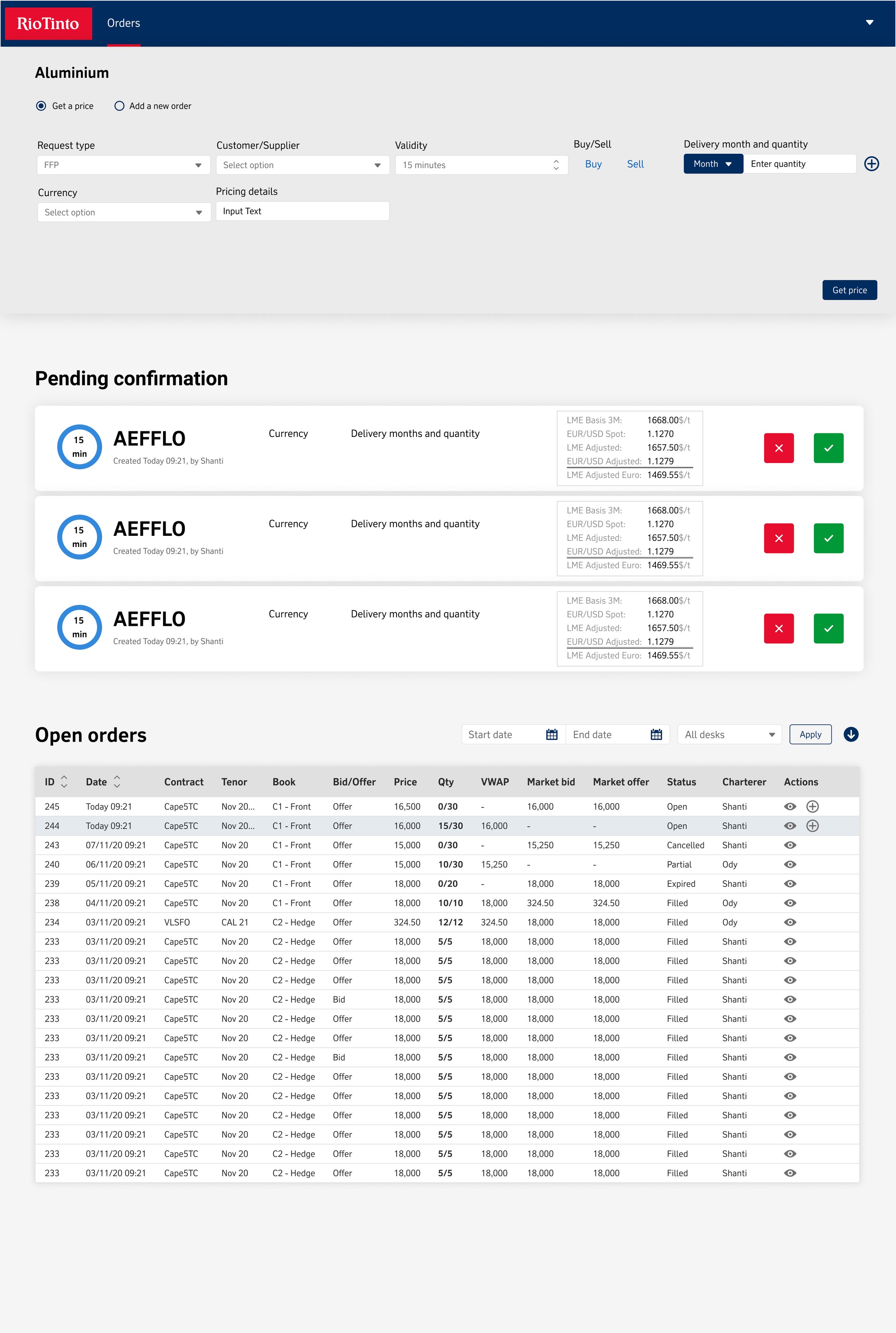
The next issue that needed to be handled was error states. My first step was to map out all the different levels of error states, taking into account their specific causes and potential impacts. Following this, I set out to create a comprehensive plan for addressing each error state, determining the most appropriate course of action for resolution. Finally, I outlined the specific circumstances and locations in which these error states should appear, ensuring that users would receive timely and relevant notifications.
As this original process was initially a very paper-oriented, administrative process, the current transition only involved shifting from manual pen-and-paper methods to digital formats like email and Excel. However, this shift presented an unexpected challenge as it affected the users' comfort level with making new requests, placing orders, and navigating the Maturity prices. Addressing these concerns required adhering to Jakob’s Laws of consistency in designing systems that users were already familiar with, ensuring a smoother transition and user experience.
After these fundamental issues had been addressed I was to work on each section of the portal as seen below


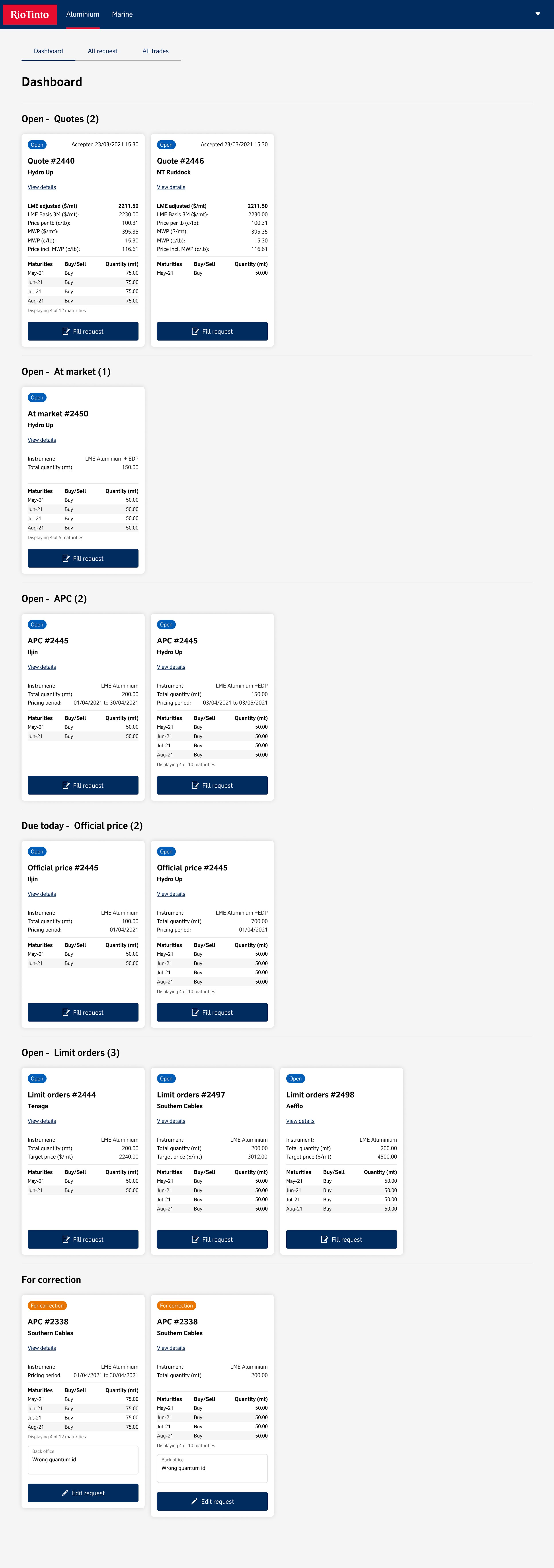
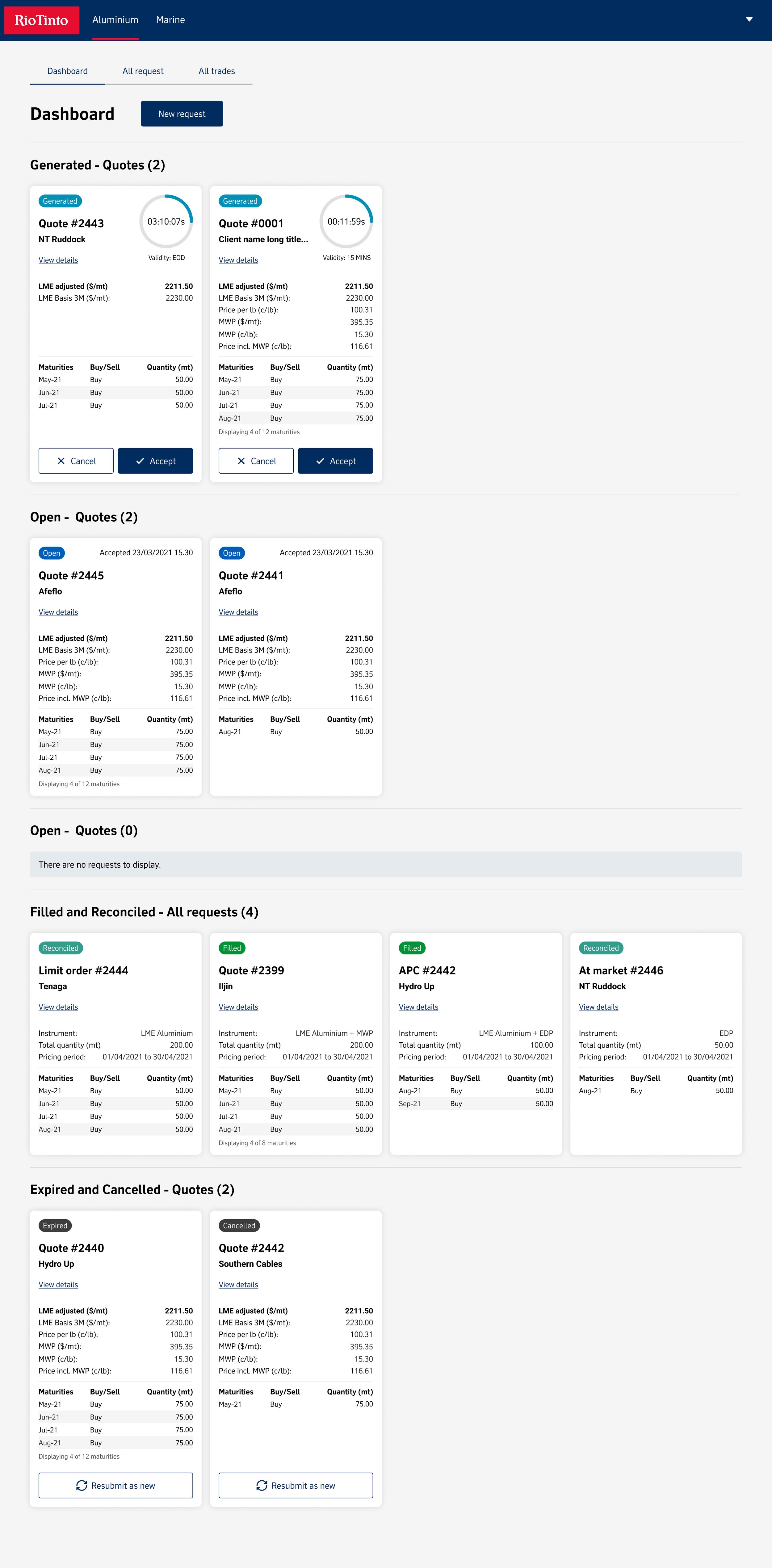
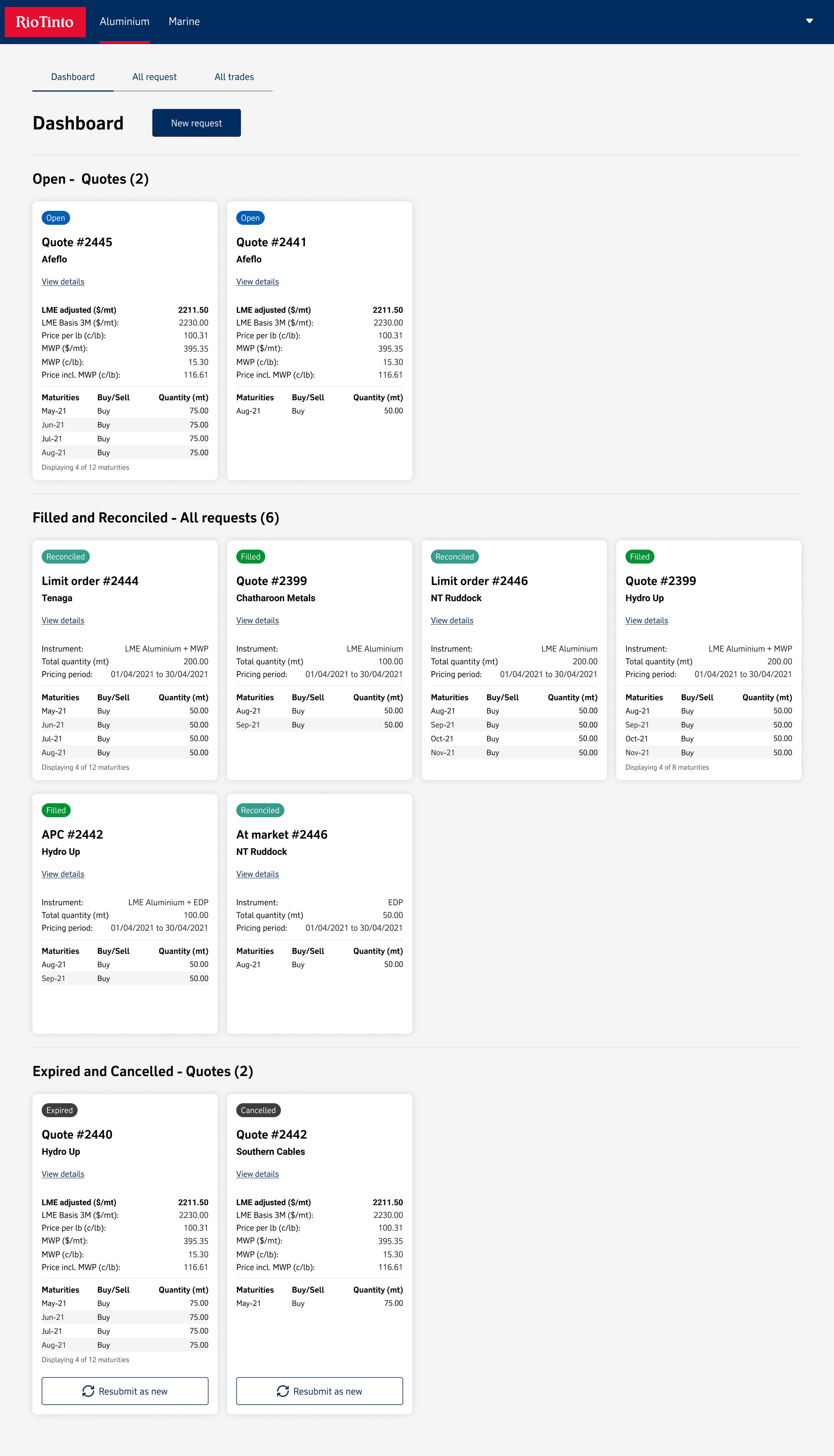
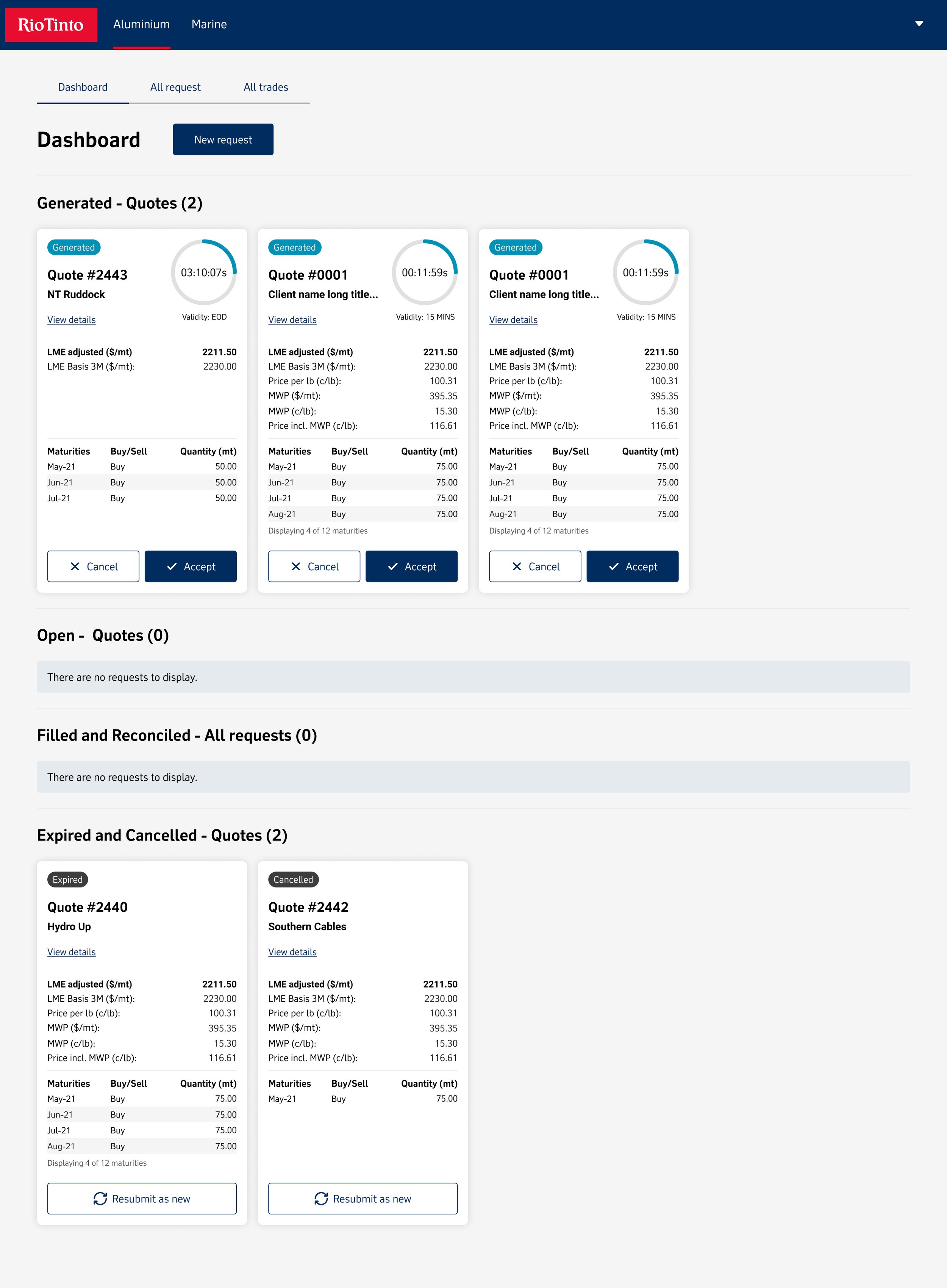
Dashboard
When looking at the Dashboard, we conceived multiple variations in an attempt to capture the comprehensive insight and user-friendly interface we were aiming for. Despite this, none seemed to fully meet our objectives. However, this exploratory research allowed for A/B testing to be conducted, and qualitative data revealed that users prefer cards views as a quick reference guide for hepatitis. This preference was further confirmed through onsite shadowing of traders, both in the office and on dockside at ports.


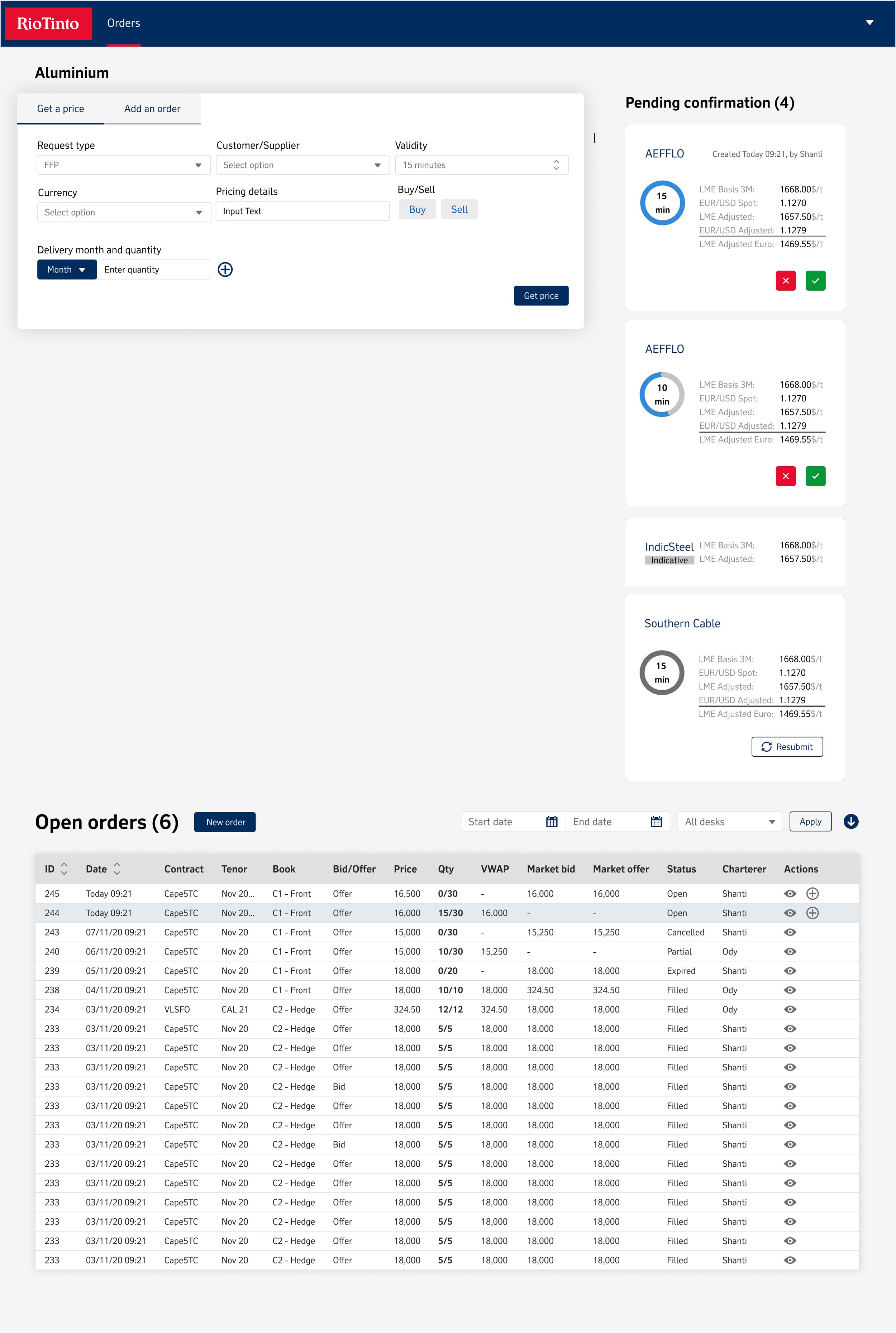
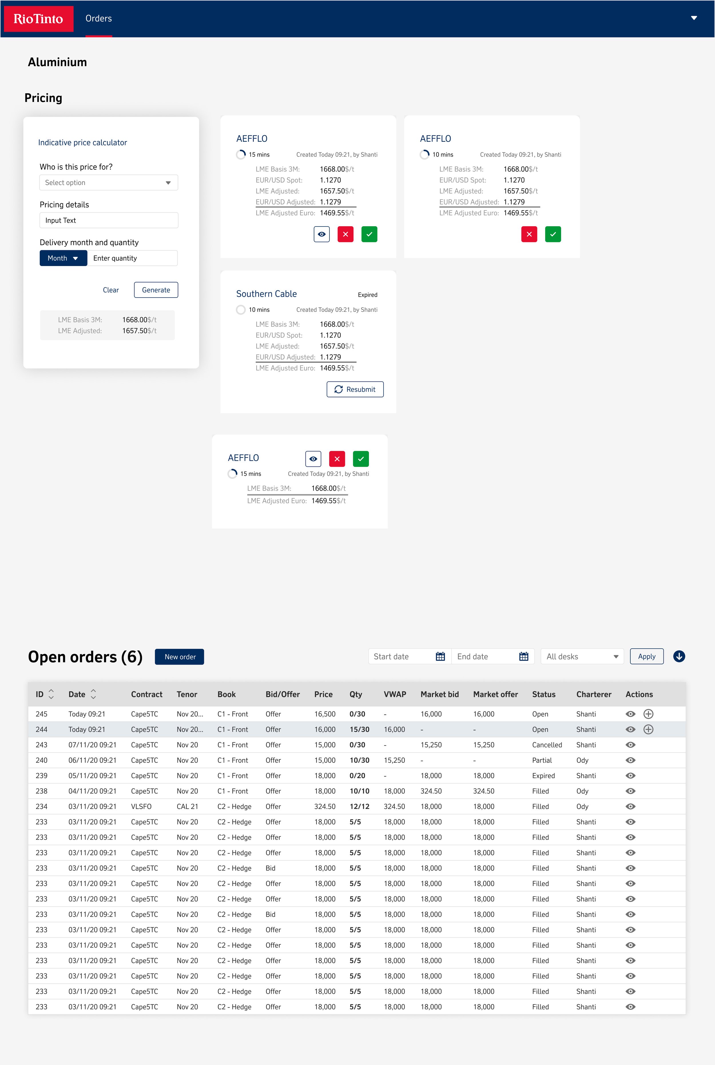

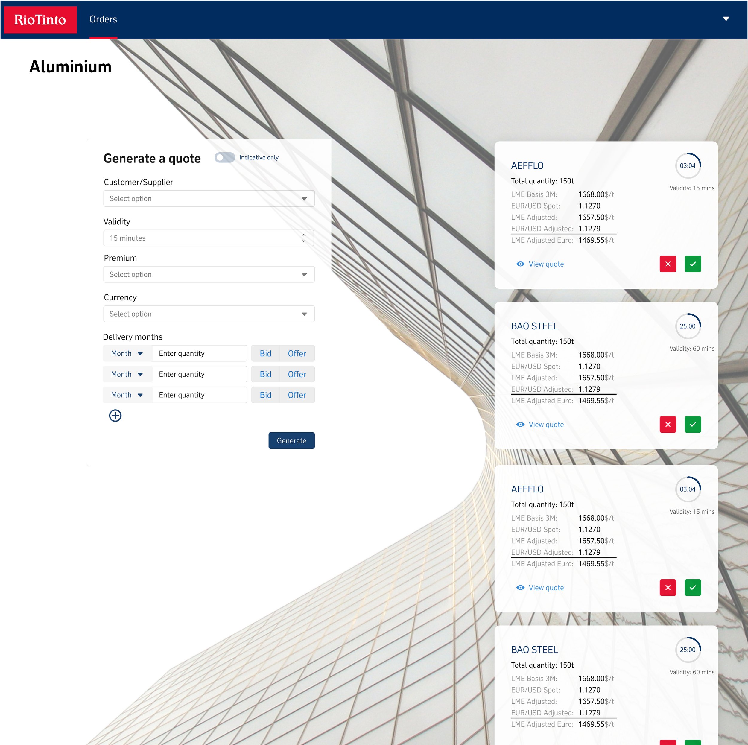

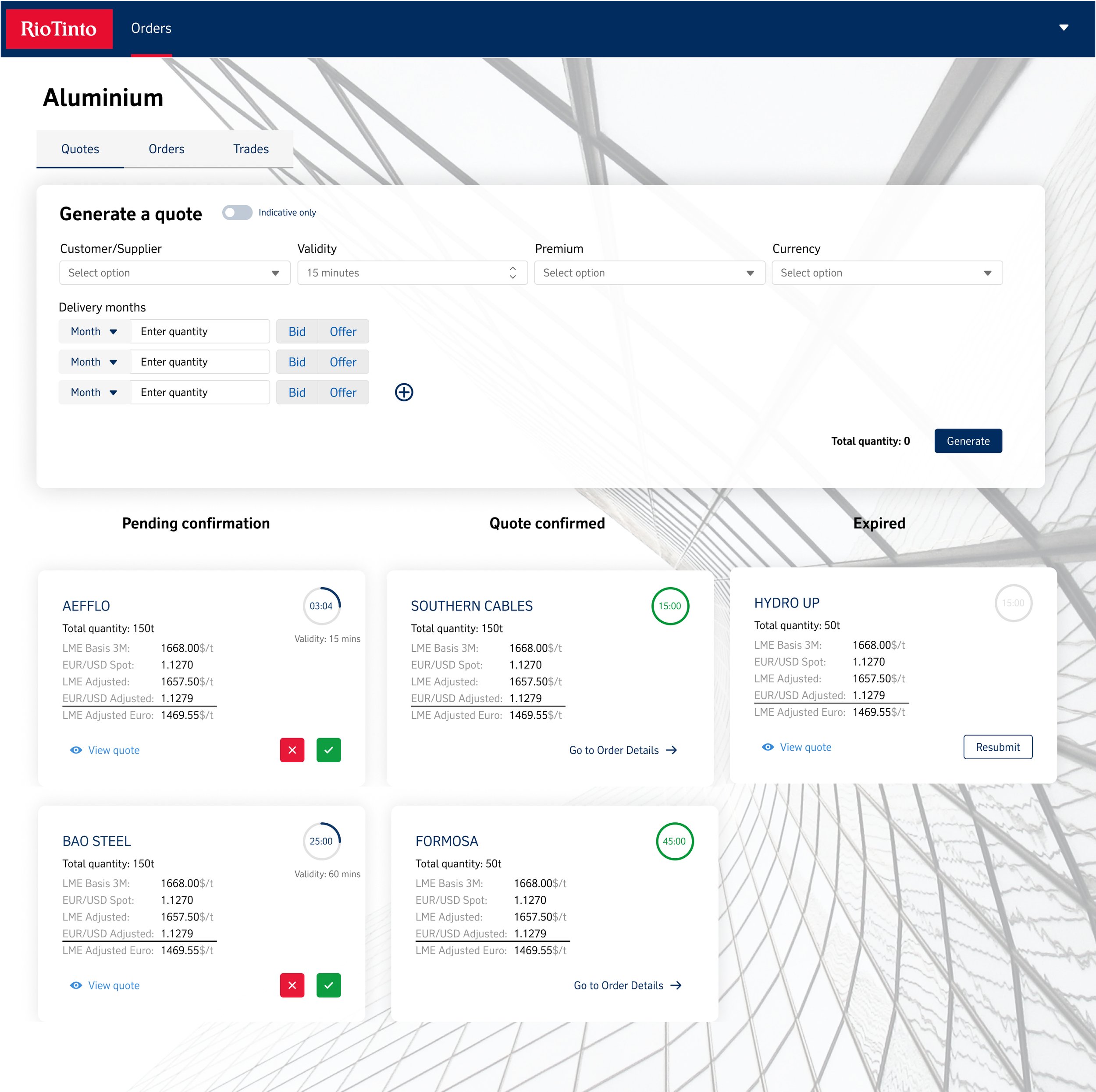
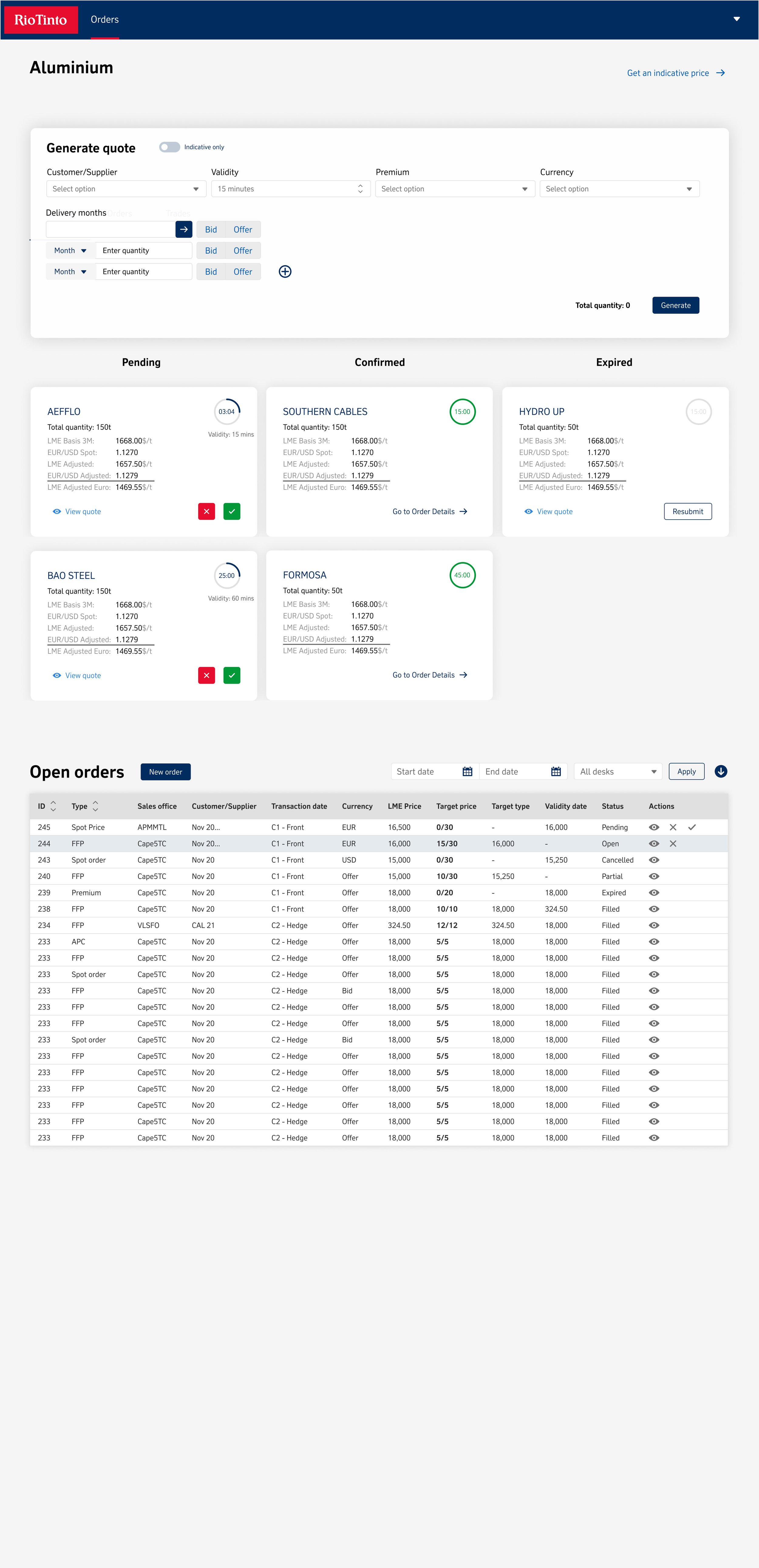

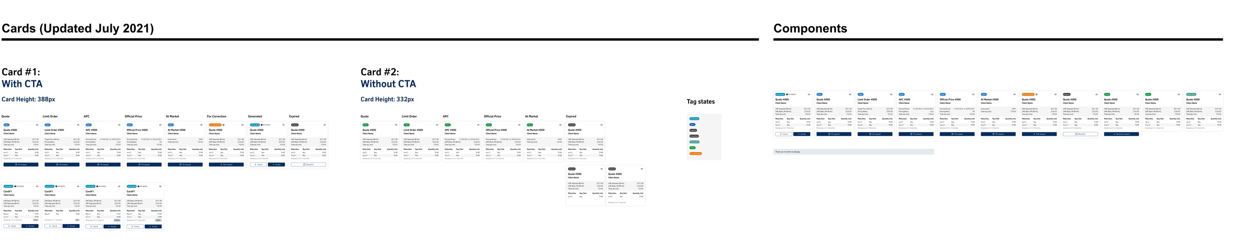
Cards
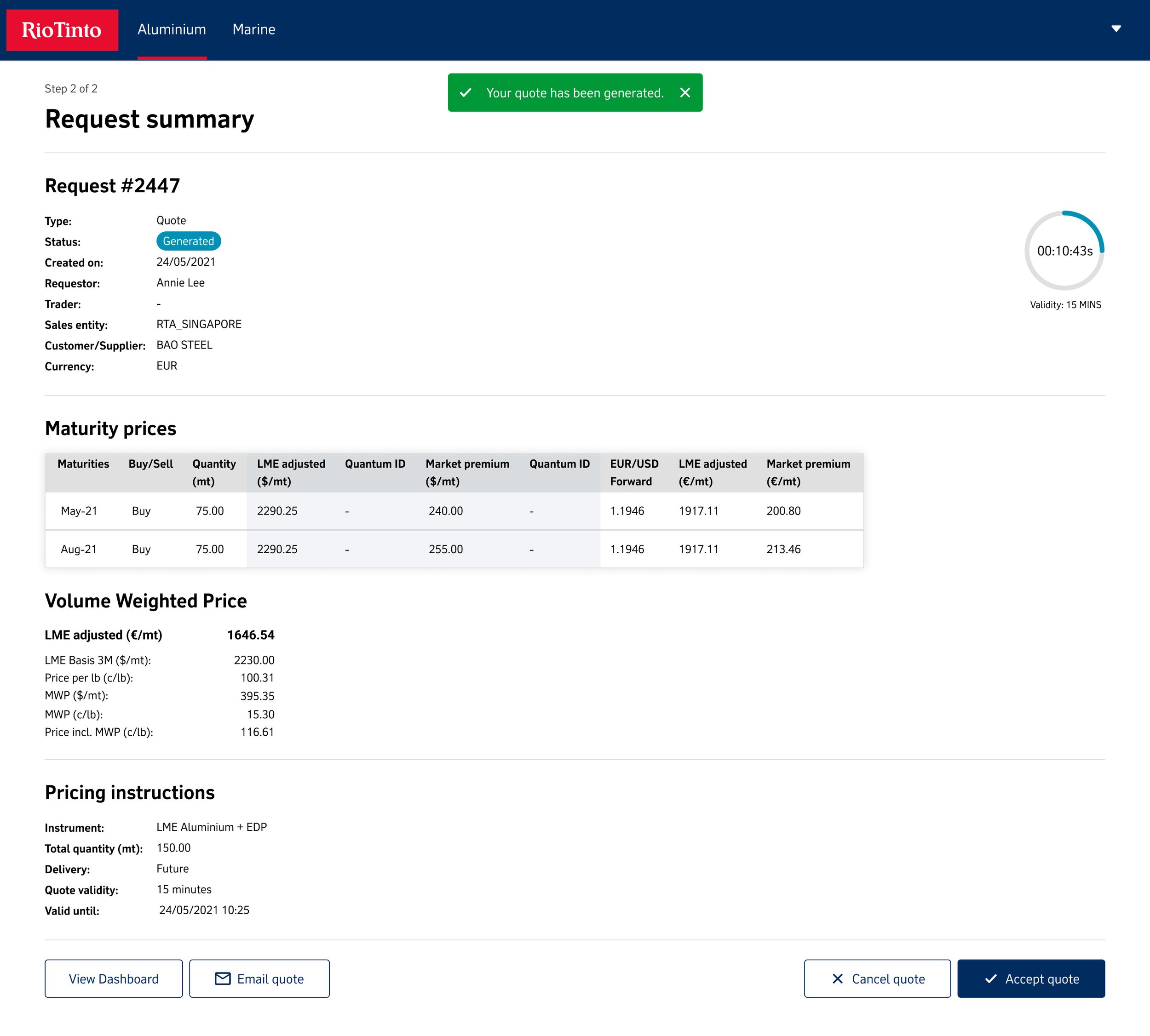
When analyzing the card's design, we envisioned incorporating 6 core elements to cover status, time orderID, adjusted price, Maturities, and CTA buttons at the bottom. Understandably, this comprehensive approach would introduce a significant cognitive load on the user. Therefore, it was essential to filter and organize the data into lanes of importance on the screen. It was decided that the cards would be positioned in lanes representing Generated, Open, and Expired or Canceled Quotes, thereby streamlining the user's interaction with the information.


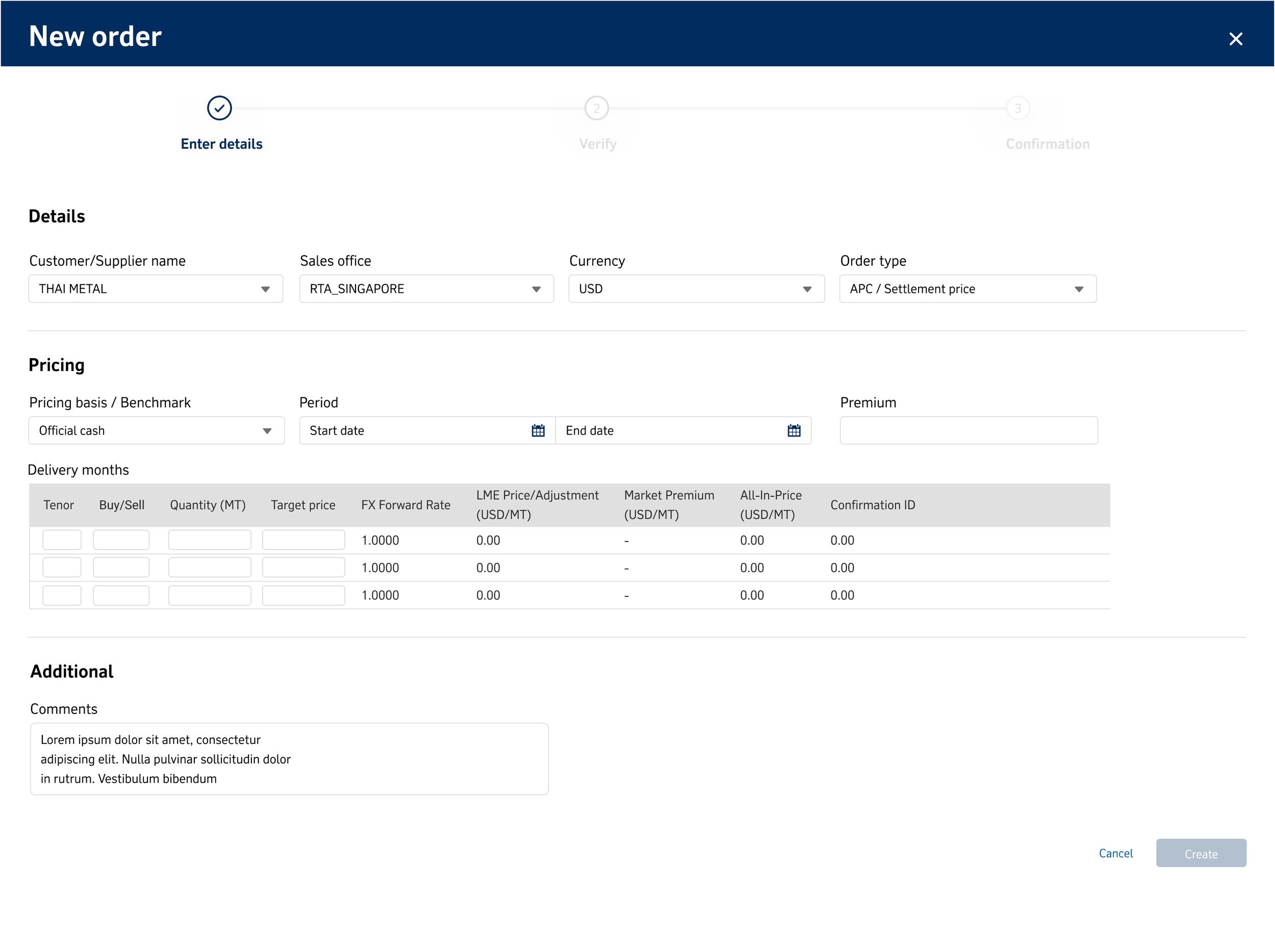
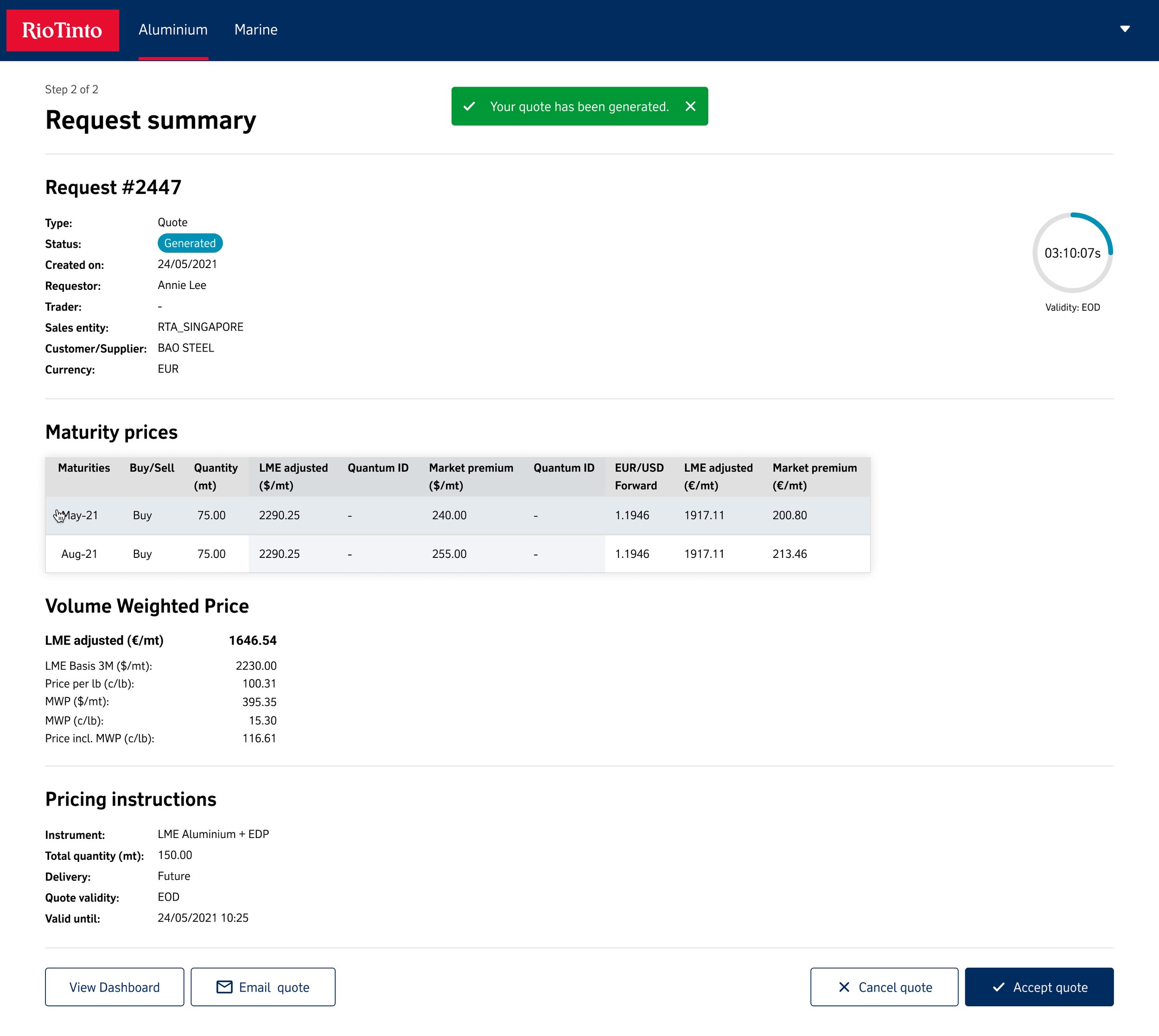
Create a new request
Aside from the Dashboard, the new request screen would be the most frequently viewed page for the user. This screen is constantly evolving and may change throughout the trade process. Therefore, three key elements were prioritized. Firstly, the request status must be consistently reflected in the same visual cues as used within the cards UI. Secondly, the adjustments to maturity and volume price should seamlessly interact with users, leveraging Excel table contexts. Lastly, pricing instructions serve as a final check and guiding light, providing a sense of clarity and direction akin to a legend.


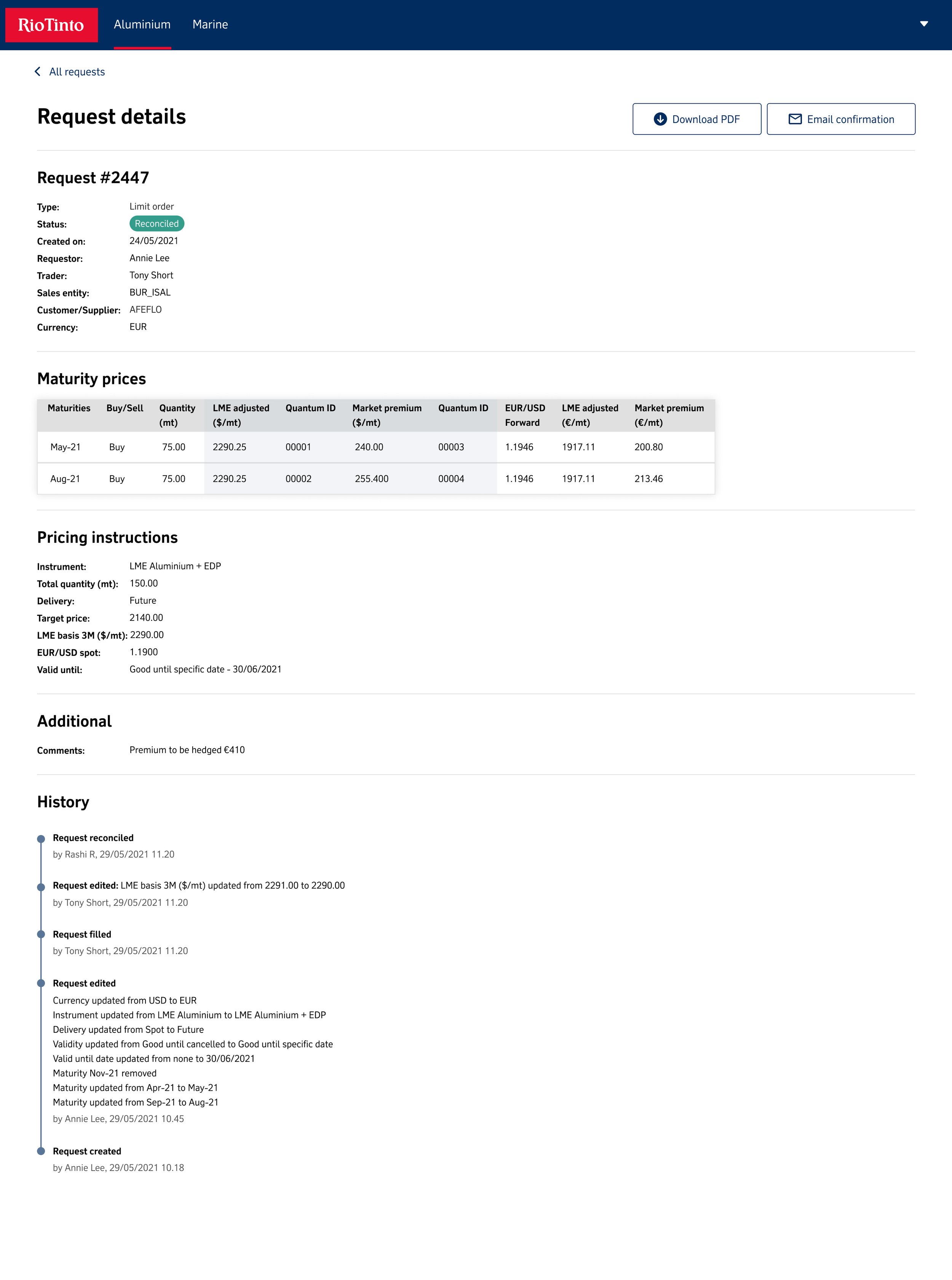
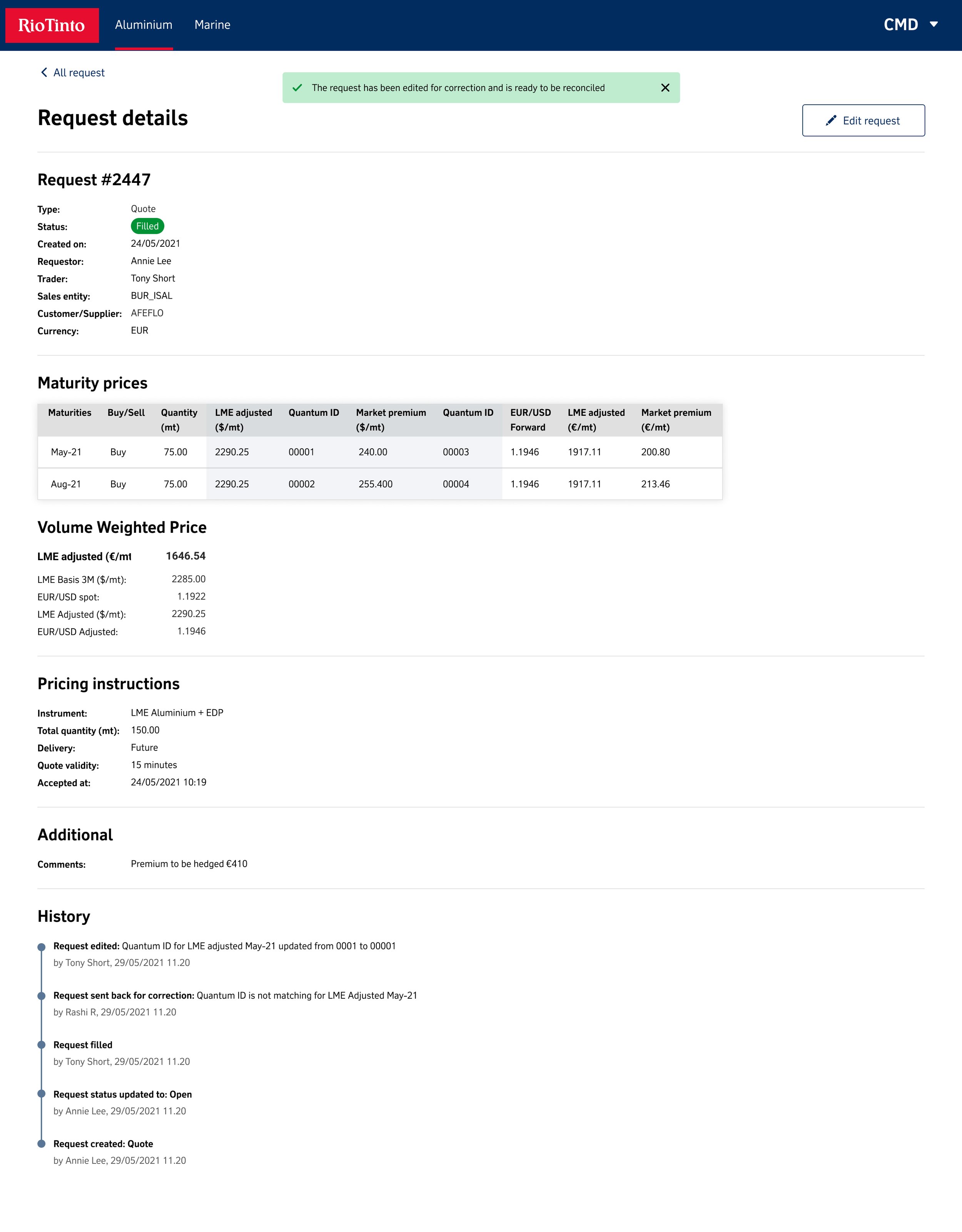
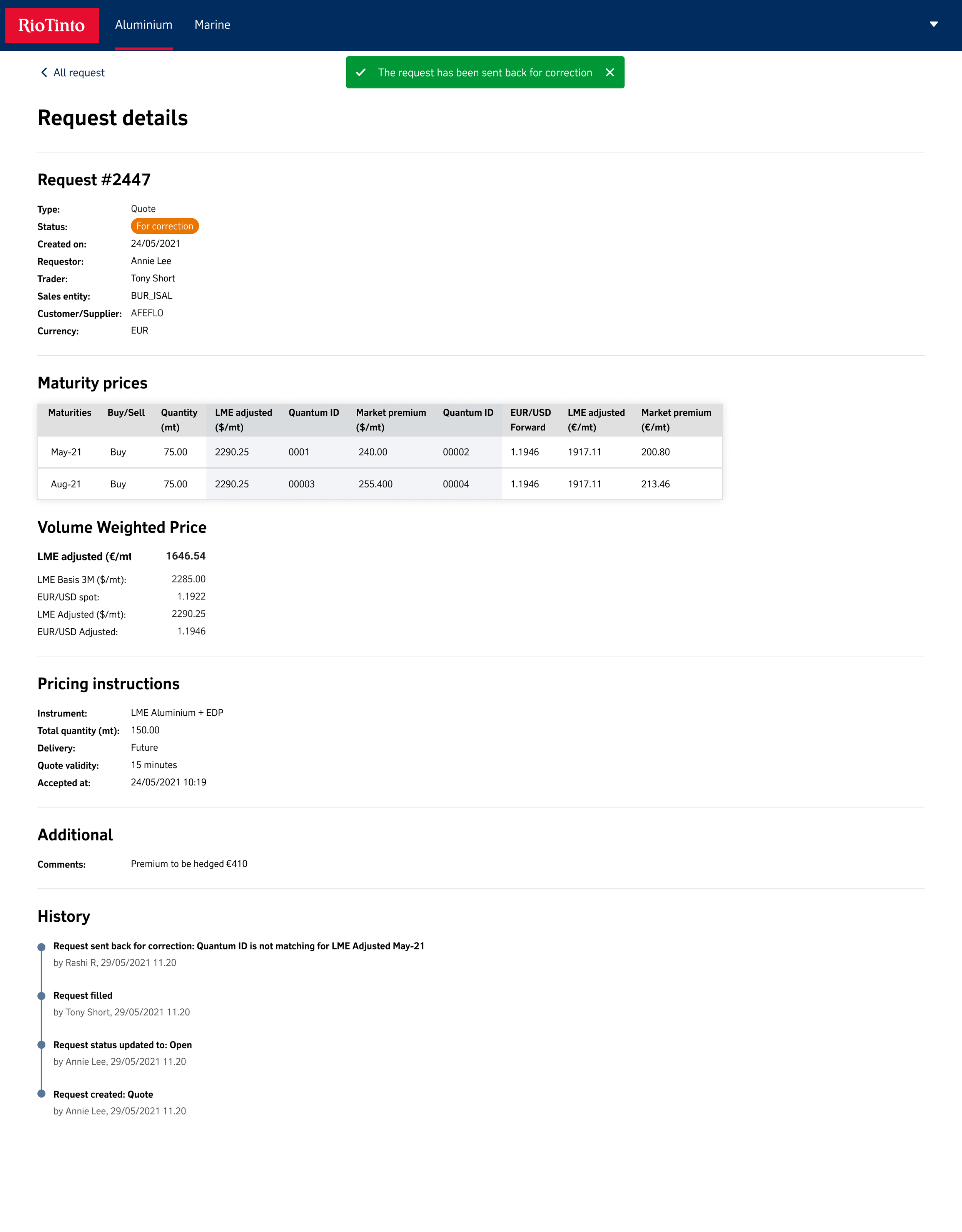
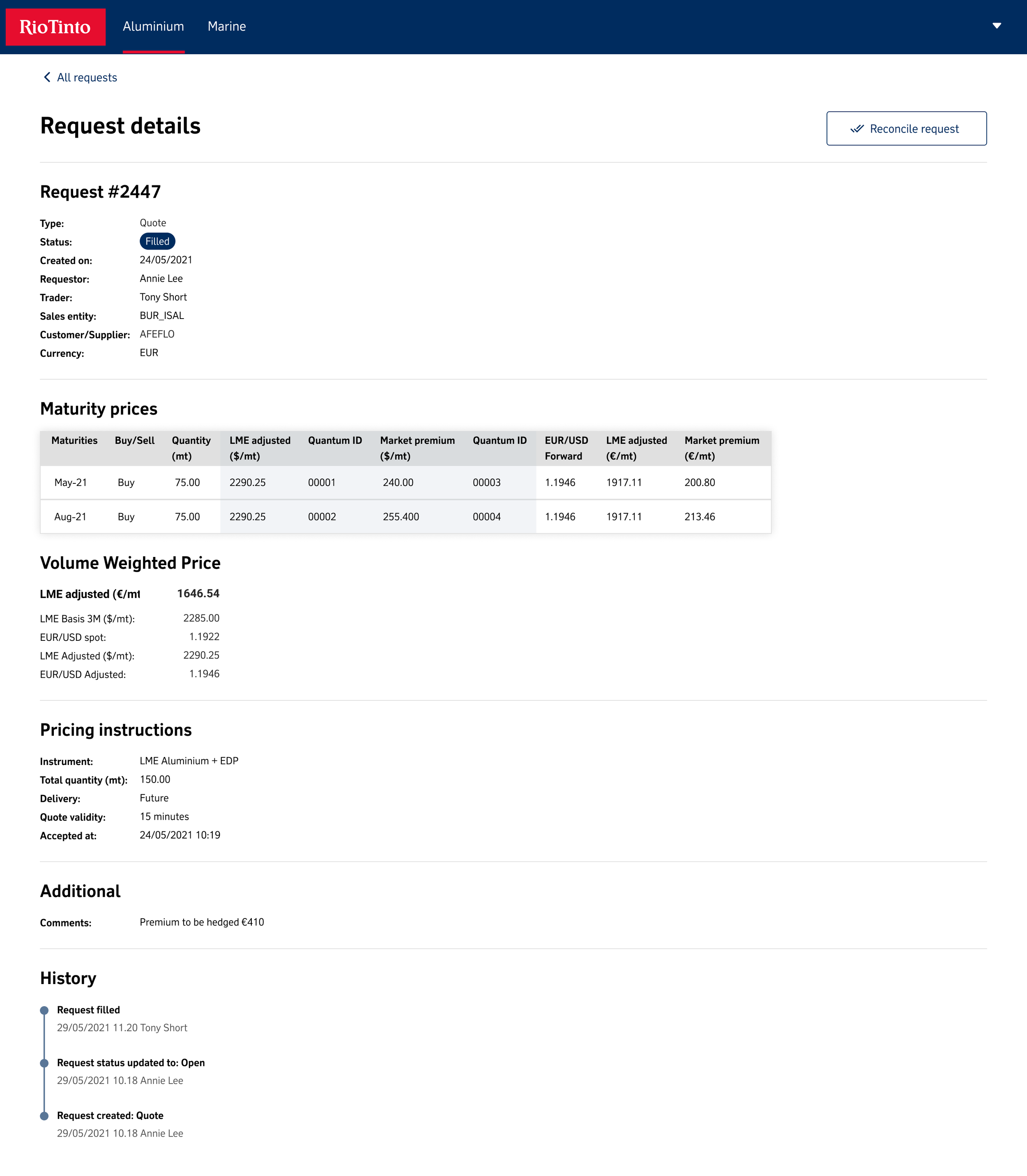
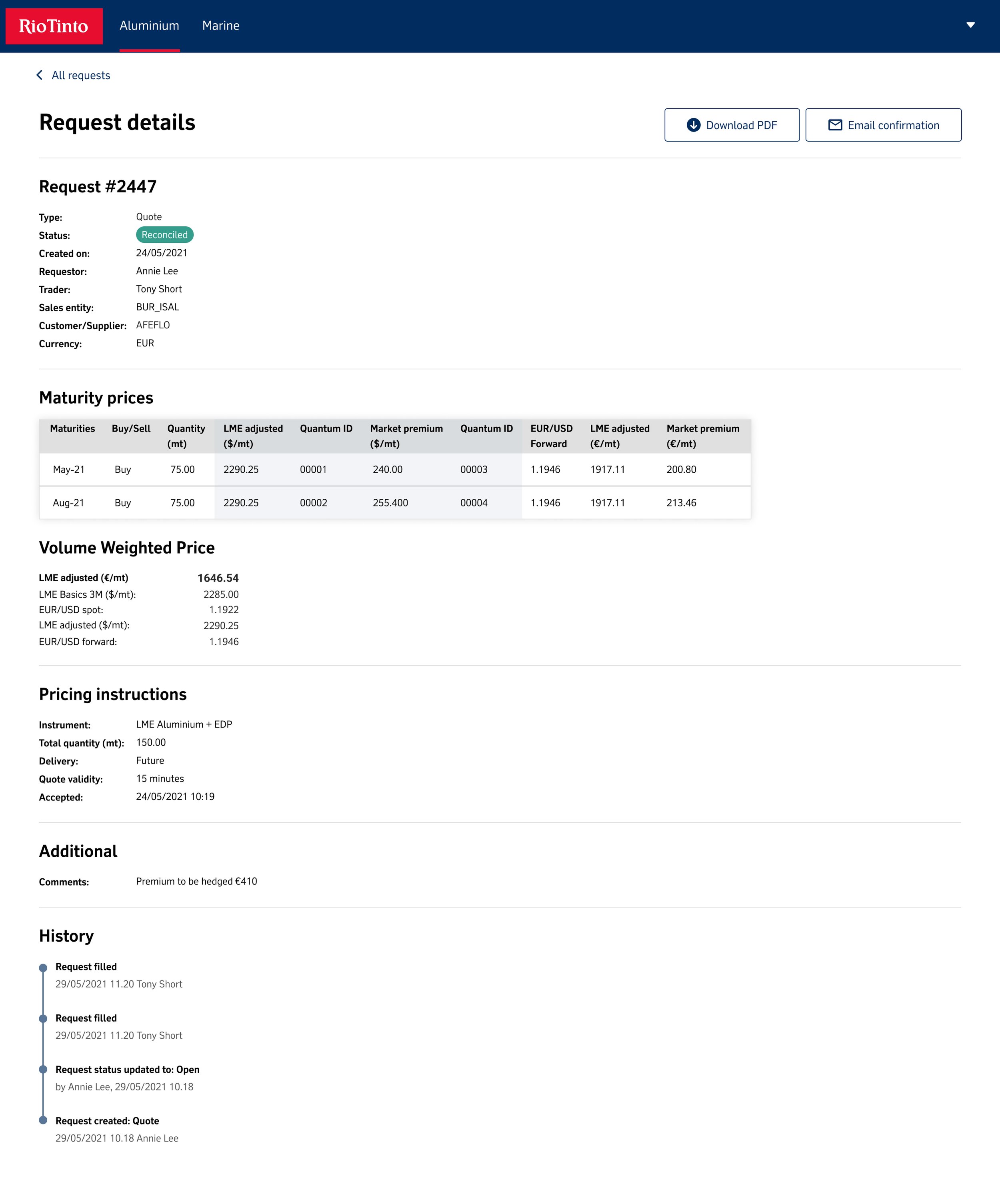
Audit history
Once we had established a standardized screen hierarchy, we delved into the various elements of the Rio Tinto Design System that were currently in development. Our focus was on testing how these elements could effectively illustrate the passage of time. In particular, we harnessed the timeline component to showcase past interactions within the trade, demonstrating its versatility in real-world applications.


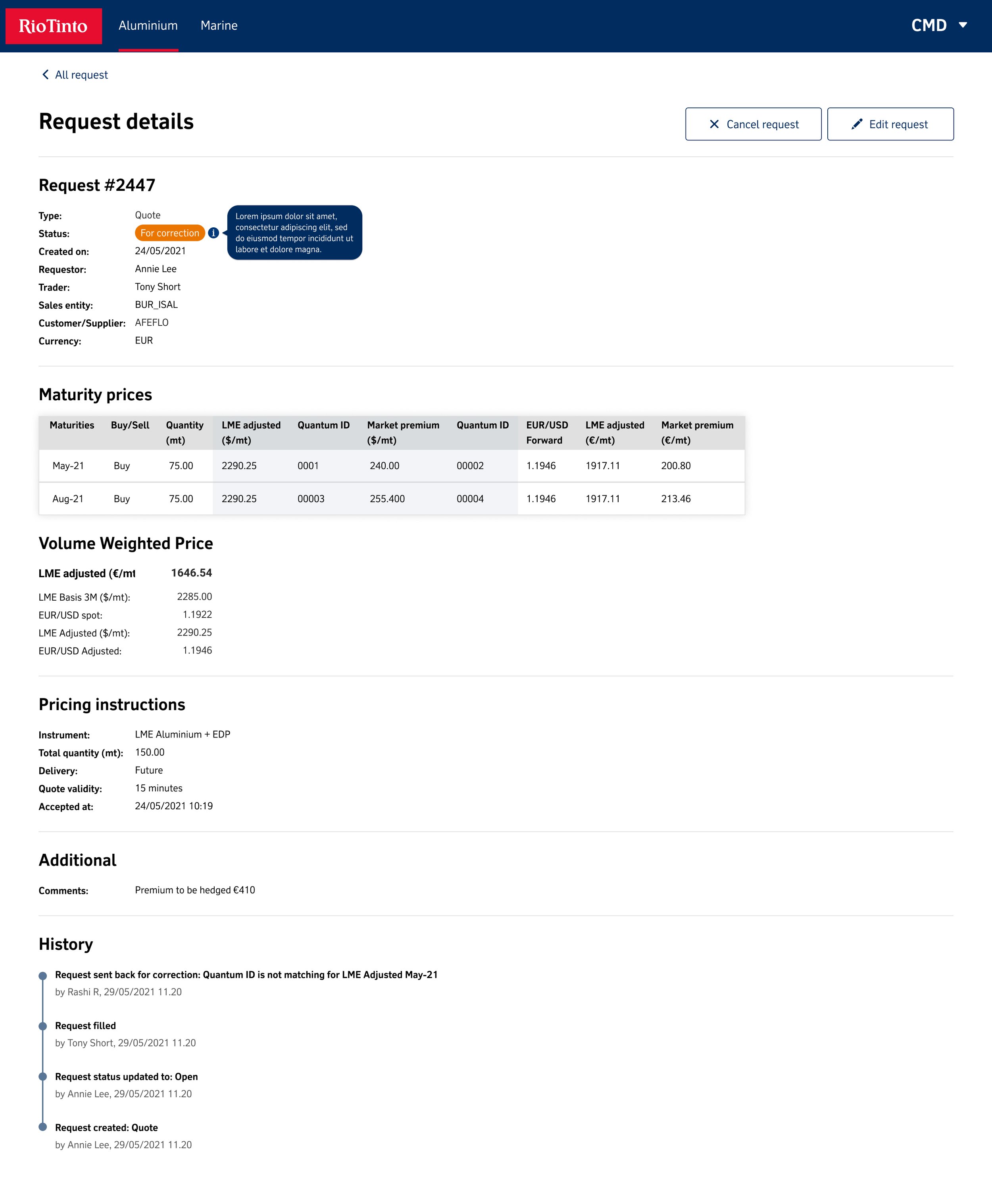
Corrections
When users needed to make amendments to their request, the user interface (UI) was specifically designed to prioritize the status update and error banner copy, enabling users to clearly understand what had transpired after they made an amendment to a trade. Moreover, information "i" pop-outs were strategically incorporated to provide users with additional context and guidance, ensuring a seamless and intuitive experience.

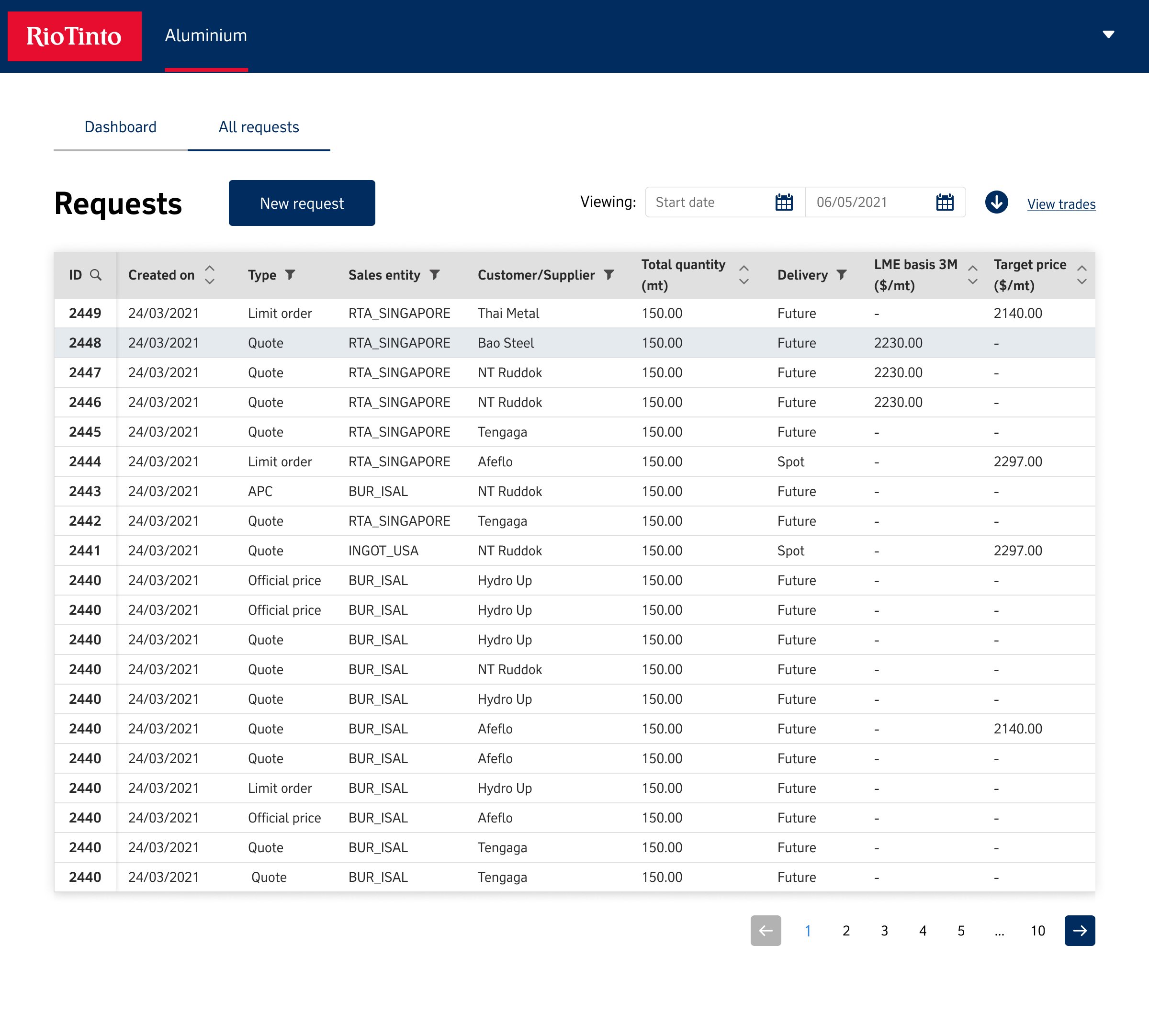
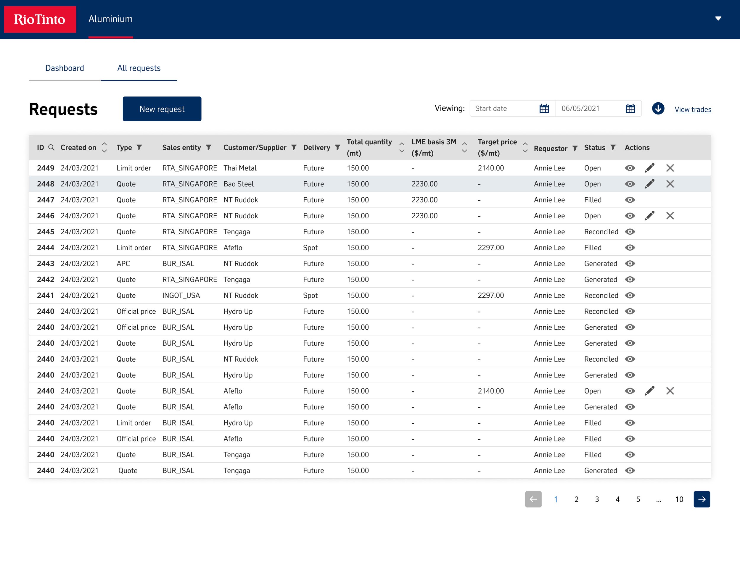
Request
From extensive user interviews, the feedback received emphasized the varying perspectives on data based on factors such as the device being used, the time of access, and the user's location. This comprehensive research led to the conclusion that the CMD system had to be inherently sensitive to the contextual requirements of time and place for users. It became clear that the Request screen had to be designed with a standard table layout, incorporating the necessary taxonomy filters that users demanded, as research indicated that requests were commonly structured in this fashion. Meanwhile, the dashboard was conceived as more of a heads-up display (HUD) view to cater to users on the go or as it became more important viewing the portal on a mobile device.
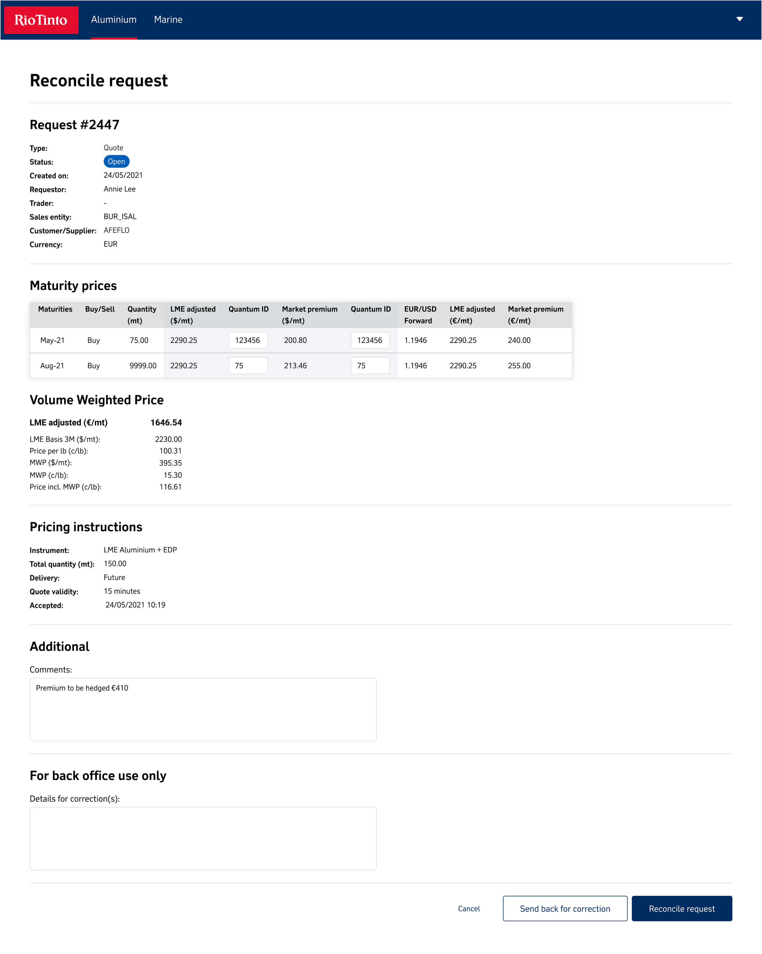
Reconcile
The Reconcile flow, as per the standards of Jakob’s Law of consistency, adhered to the principles while further leveraging the foundation set by the evolving Rio Tinto Design System, which was undergoing simultaneous development.

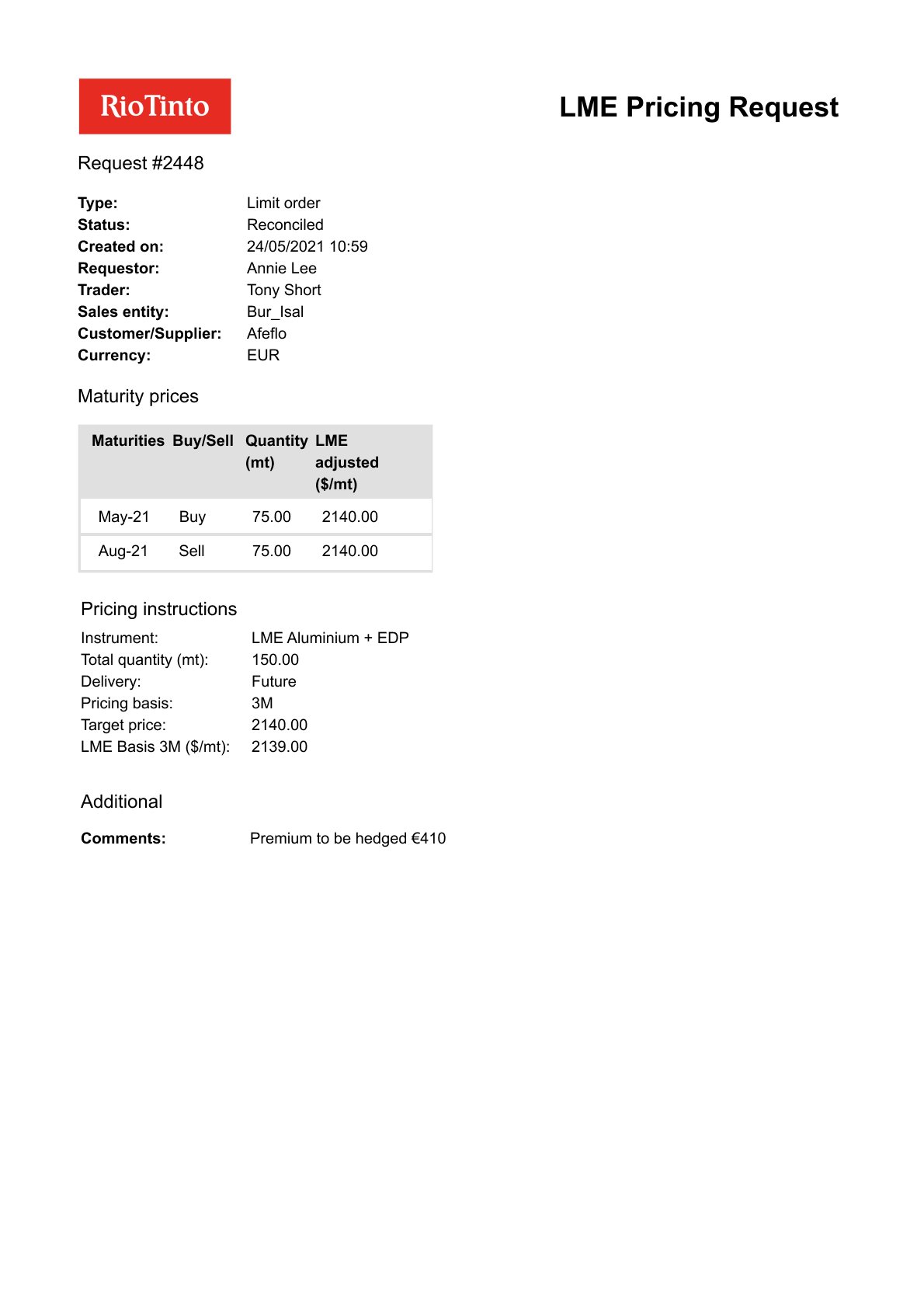
Download
In our assessment, we identified a crucial but often underestimated aspect of the user experience: the transition phase. Our users have long been accustomed to the security and familiarity offered by pen and paper, and more recently, email. While the shift to a comprehensive login system is essential, we must recognize the significance of retaining certain legacy features to instill a sense of trust and comfort. One such feature that was initially overlooked, but now stands as a pivotal addition, is the ability to download PDFs. This seemingly minor inclusion plays a significant role in ensuring a smooth and reassuring transition for our users.
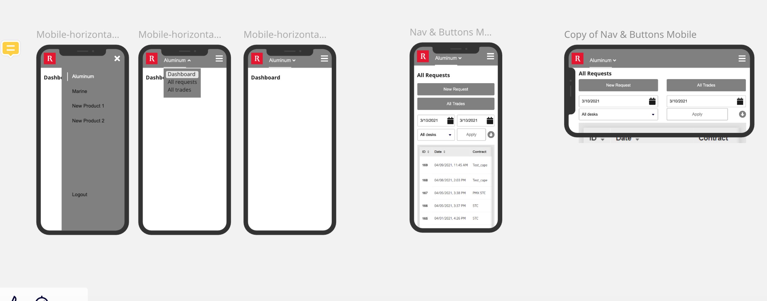
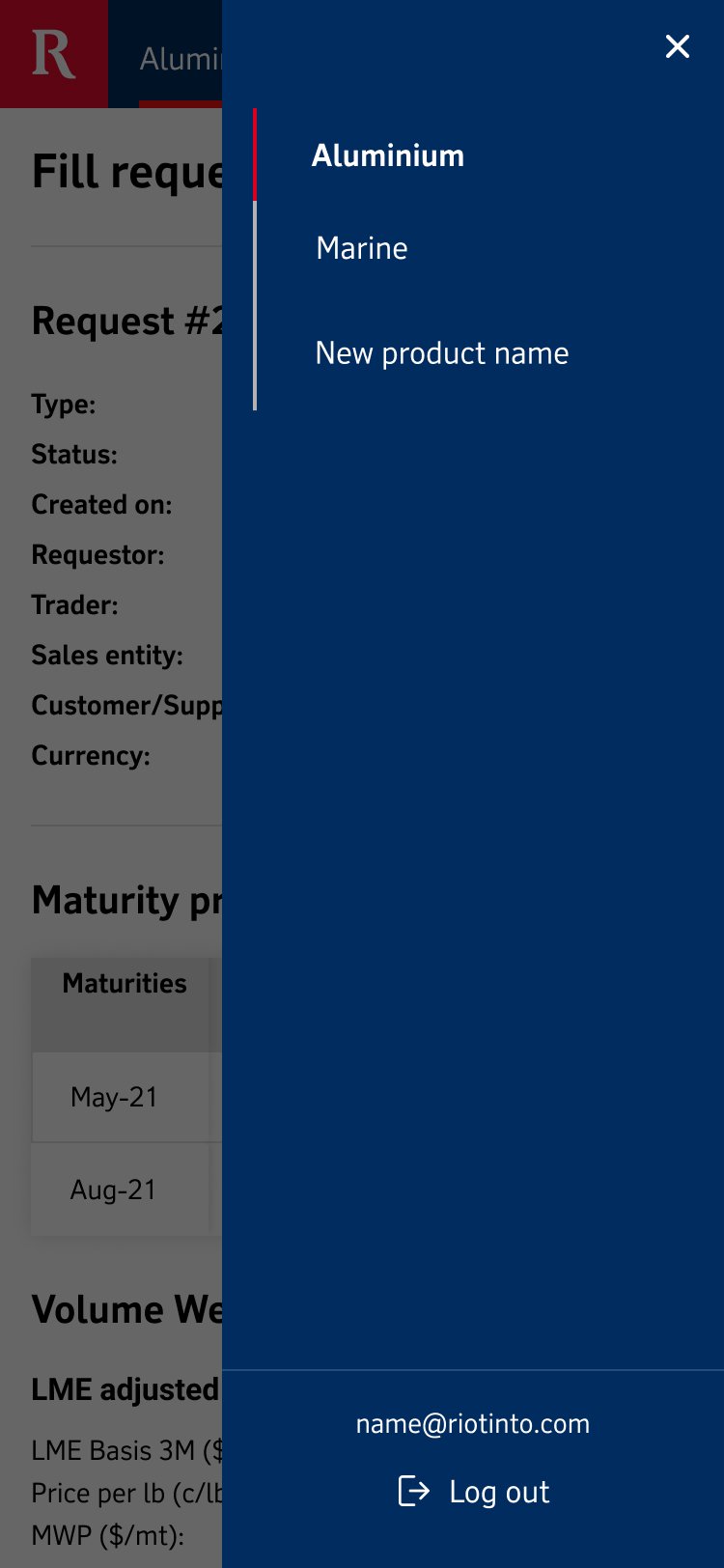
Mobile
The design of the portal in a mobile view was a pivotal understanding for the user. Speaking with users, it was relayed that they would have to bring a work laptop home or onsite to view before they could do what they needed on a mobile device. This updated iteration was by far the most important and consequential in its deployment of the portal, considering the increasing reliance on mobile devices for work-related tasks.