Ding App
-
Introduction
Brief: Redesign the Ding mobile top-up app for a smoother, more delightful experience.
Challenge: Make topping up as fast and clear as possible, fixing pain points I noticed firsthand while traveling.
Goals: Remove friction, polish every detail, and keep the flow dead simple.
-
Discovery Phase
Stakeholder interviews: Solo project, so I played both roles—designer and user.
Business requirements: Fast top-ups, minimal errors, and support for global users.
User needs: Quick, reliable balance checks and top-ups, even on shaky Wi-Fi.
-
Problem Framing
Problem: Existing flows had rough edges—some steps felt clunky, and visual polish was lacking.
Success: Every screen and tap feels obvious and intentional; users never get lost.
Constraints: Needed to work on older phones and spotty connections.
-
User Research
User interviews: Talked to other travelers and expats about their pain points.
Competitive analysis: Checked top-up apps for best (and worst) UX patterns.
Market research: Confirmed speed and clarity trump extra features.
-
Synthesis
Personas: Frequent travelers, expats, and locals with prepaid phones.
Journey mapping: From low balance alert to successful top-up in under a minute.
Key insights: Users want reassurance at every step—no hidden fees, clear confirmations.
-
Solution Development
Info architecture: Streamlined flows—home, balance, top-up, confirmation.
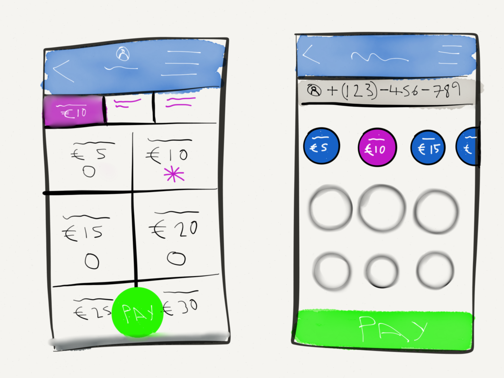
Wireframes & prototypes: Iterated on tap targets, button placement, and error states.
Visual design: Crisp, minimal, and brand-aligned—every pixel sweated.
-
Testing
Usability testing: Ran through flows with real users and simulated bad connections.
User feedback: Tweaked button copy, improved loading indicators, and clarified error messages.
Iterations: Polished micro-interactions and confirmation screens.
-
Implementation
Handoff: Provided dev-ready mockups and specs.
Dev collaboration: Worked closely to ensure pixel-perfect builds and smooth transitions.
Go-to-market: Released as an update, promoted via in-app alerts and travel forums.
-
Results & Impact
Metrics: Faster completion times, fewer support tickets, and higher App Store ratings.
User adoption: More repeat top-ups and positive feedback from travelers.
Business impact: Helped Ding stand out in a crowded market.
Lessons learned: When you’re your own user, obsessing over every detail pays off.
While I was traveling around South Asia, I had to keep ensuring that my phone remained connected by regularly topping up my balance through the convenient Ding mobile top-up application. While I appreciated the simplicity and convenience of the app, I couldn't help but notice some areas where the user experience could potentially be enhanced through a thoughtful redesign.
As a designer, navigating through product development often involves facing numerous compromises. It's common for engineers to introduce features without a design phase, and sometimes designs are left unpolished after implementation. With this app being my own creation, I meticulously ensured that every aspect was executed to pixel-perfection.


